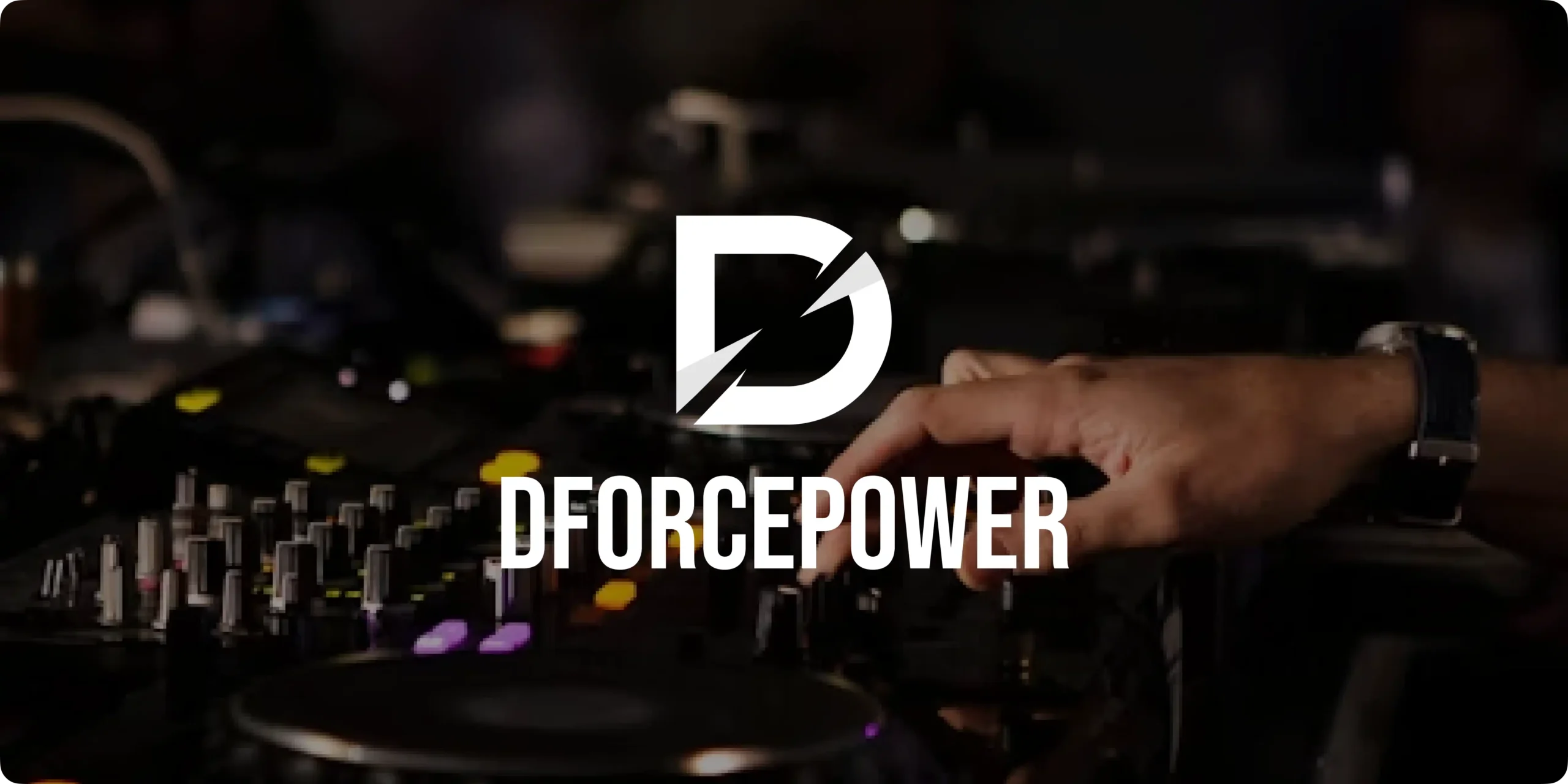
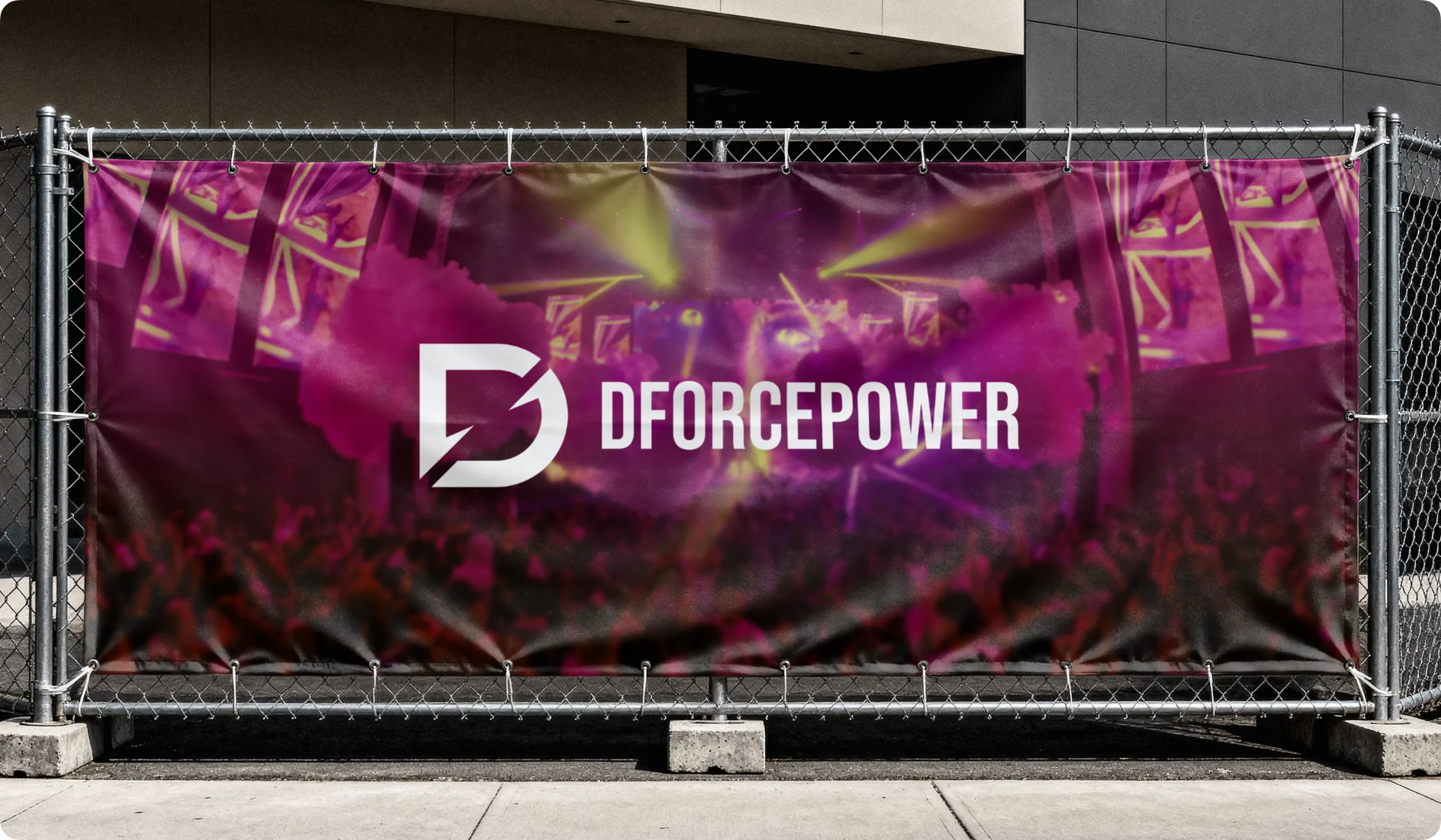
DFORCEpower is a modern dealership platform designed for the automotive audio industry, where performance, clarity, and user experience are essential. The goal of the project was to create a streamlined digital platform that helps users explore music systems, understand product specifications, and connect directly with dealers through inquiries and meeting requests. From showcasing powerful audio products to simplifying communication and offline deal coordination, the platform delivers a clear and structured browsing experience. The branding reflects this vision through a bold and modern visual identity that communicates technology, performance, and reliability across all touchpoints.
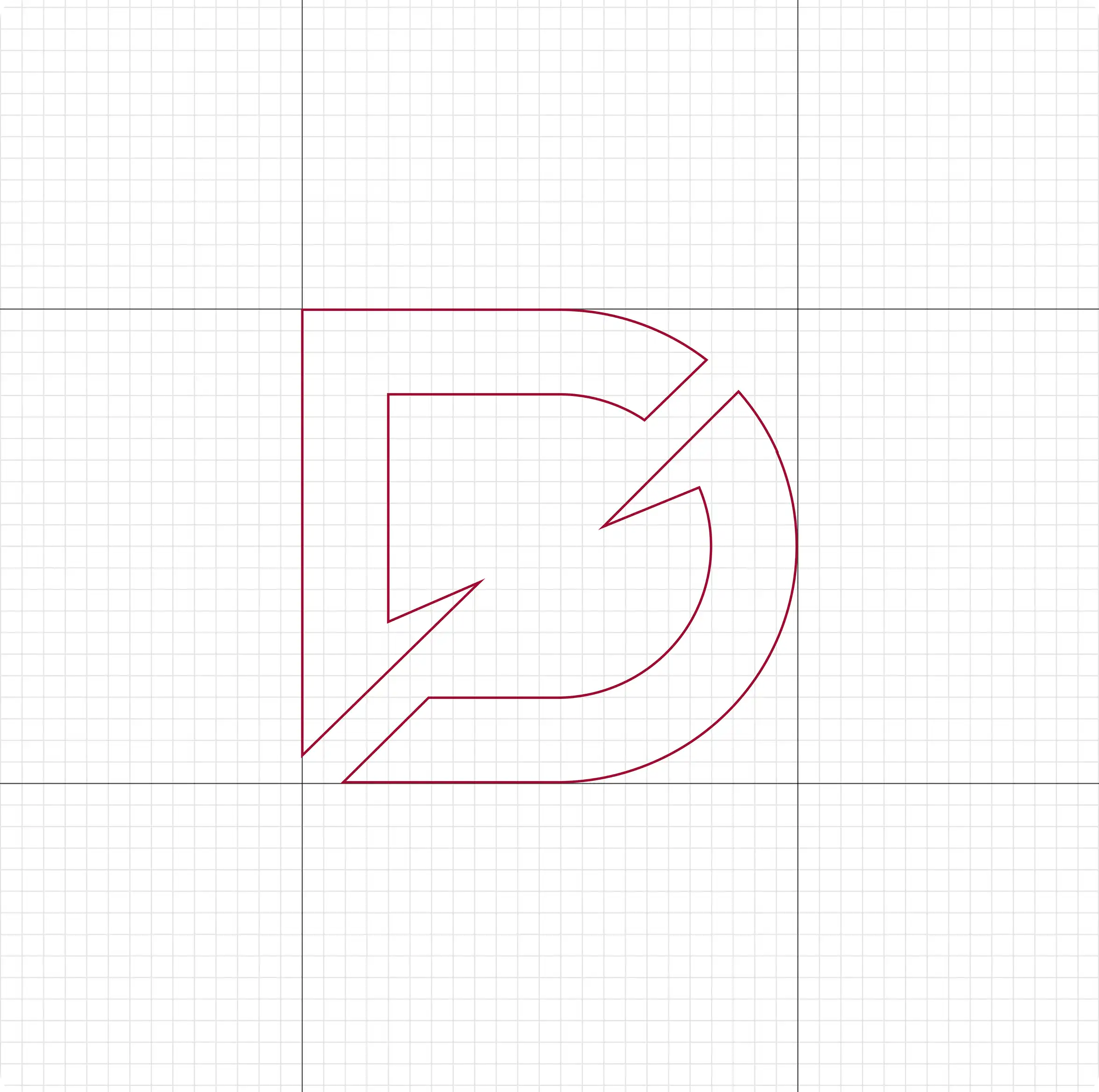
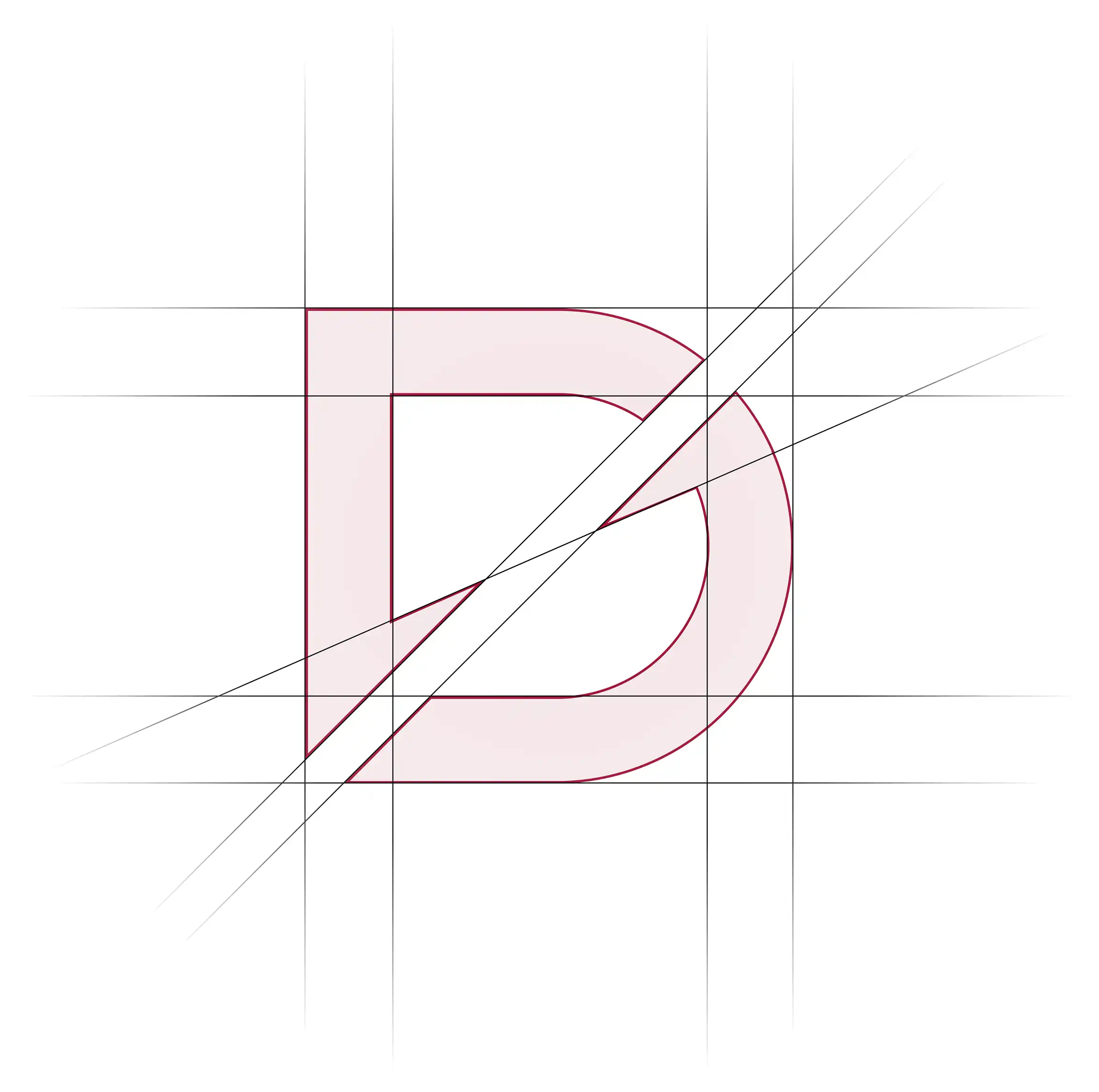
Logo Design & Concept
The logo is designed using a bold and structured form that represents power, connectivity, and modern audio technology. The symbol reflects the relationship between performance-driven music systems, dealership services, and user interaction, creating a strong visual identity that communicates reliability and confidence. Its sharp geometry and dynamic form convey energy, movement, and sound performance, while the balanced composition maintains a professional and trustworthy appearance. The design is intentionally clean and impactful, allowing it to adapt seamlessly across digital platforms, branding materials, and automotive-related applications while maintaining strong recognition.
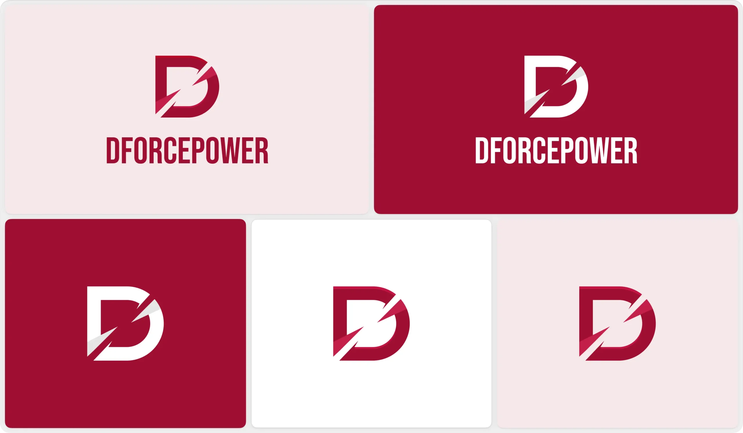
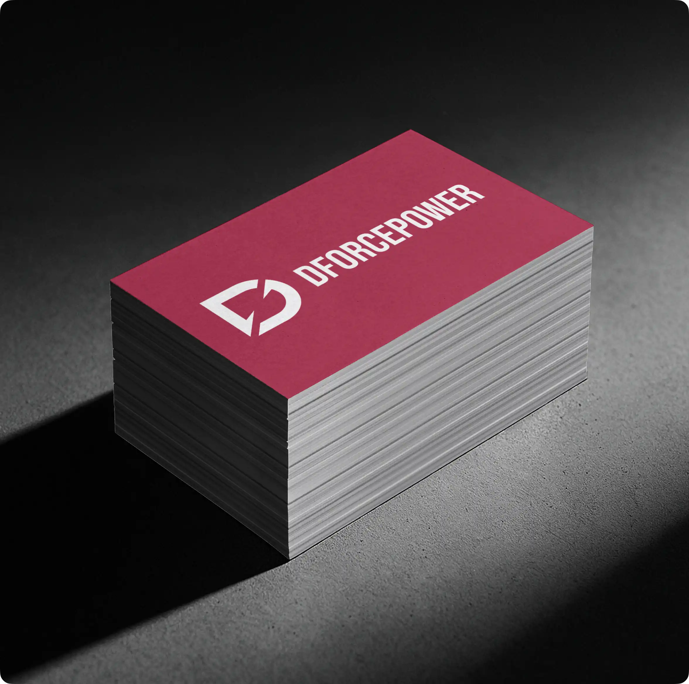
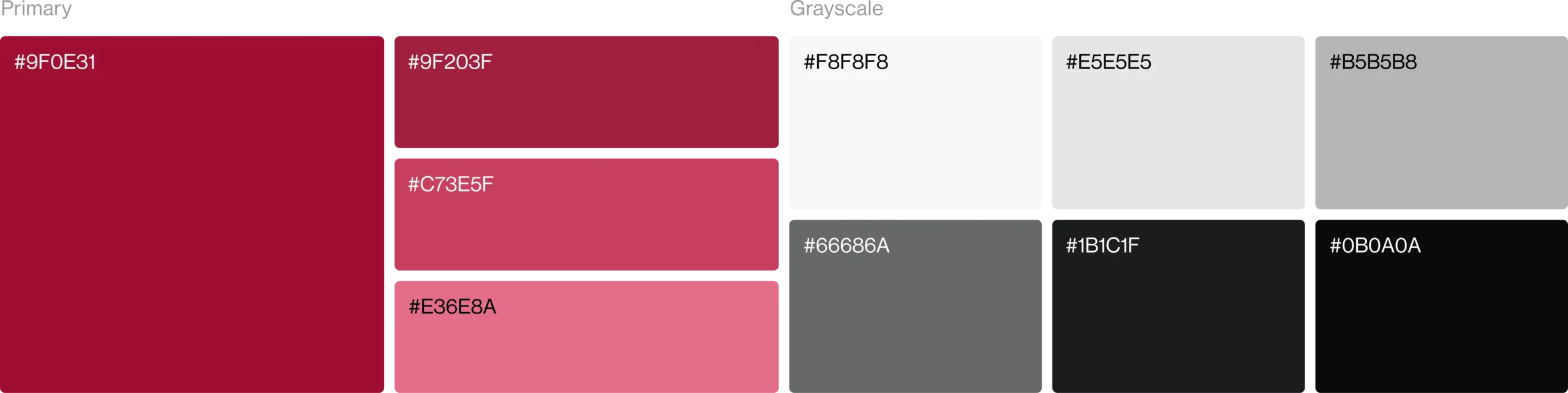
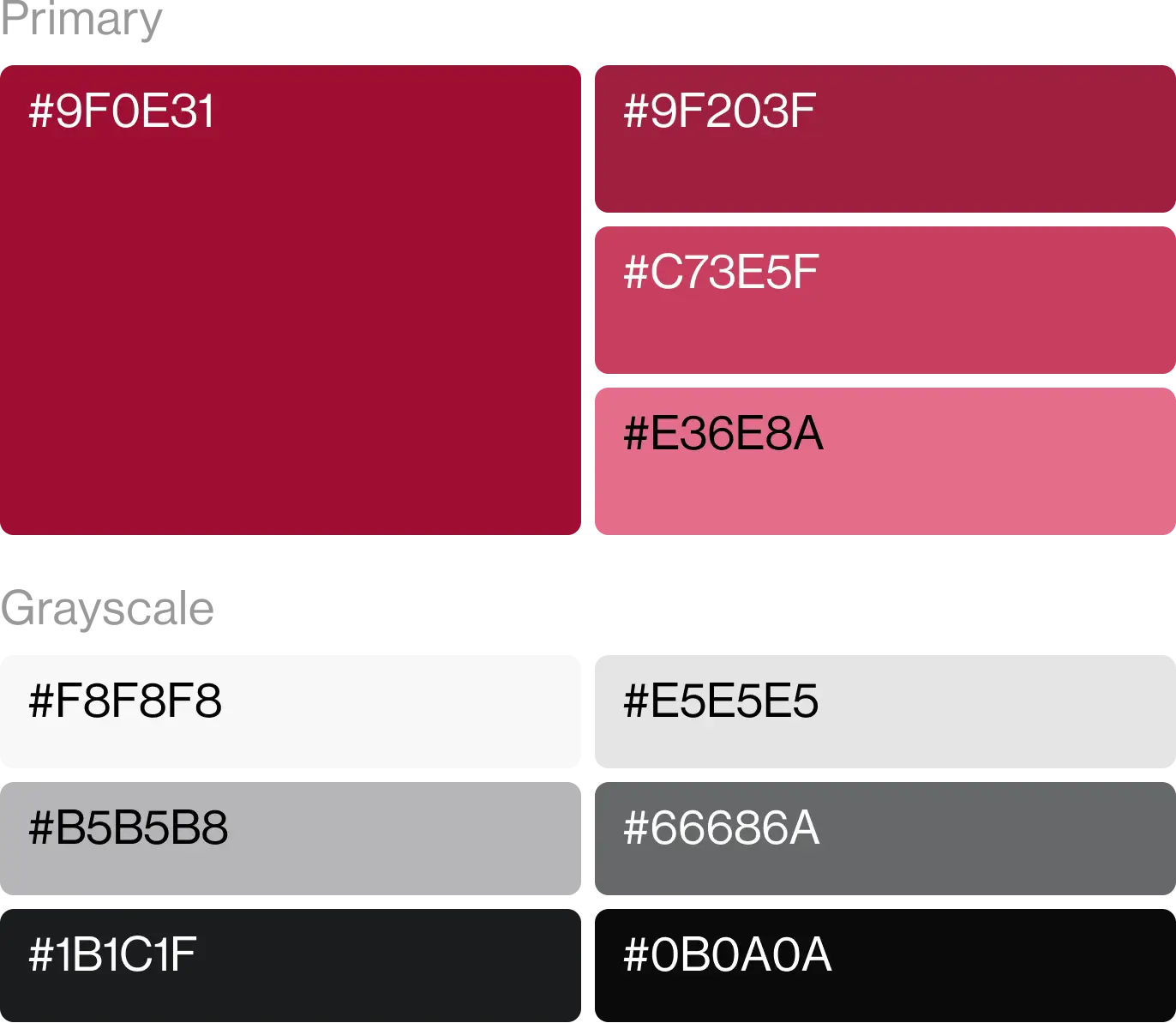
Color Palette
The color palette is built around bold and powerful tones that represent technology, performance, and modern automotive culture. It creates a strong visual presence while helping the brand stand out within the competitive audio and dealership industry. Supporting neutral tones maintain balance, readability, and consistency across all digital and branding applications.
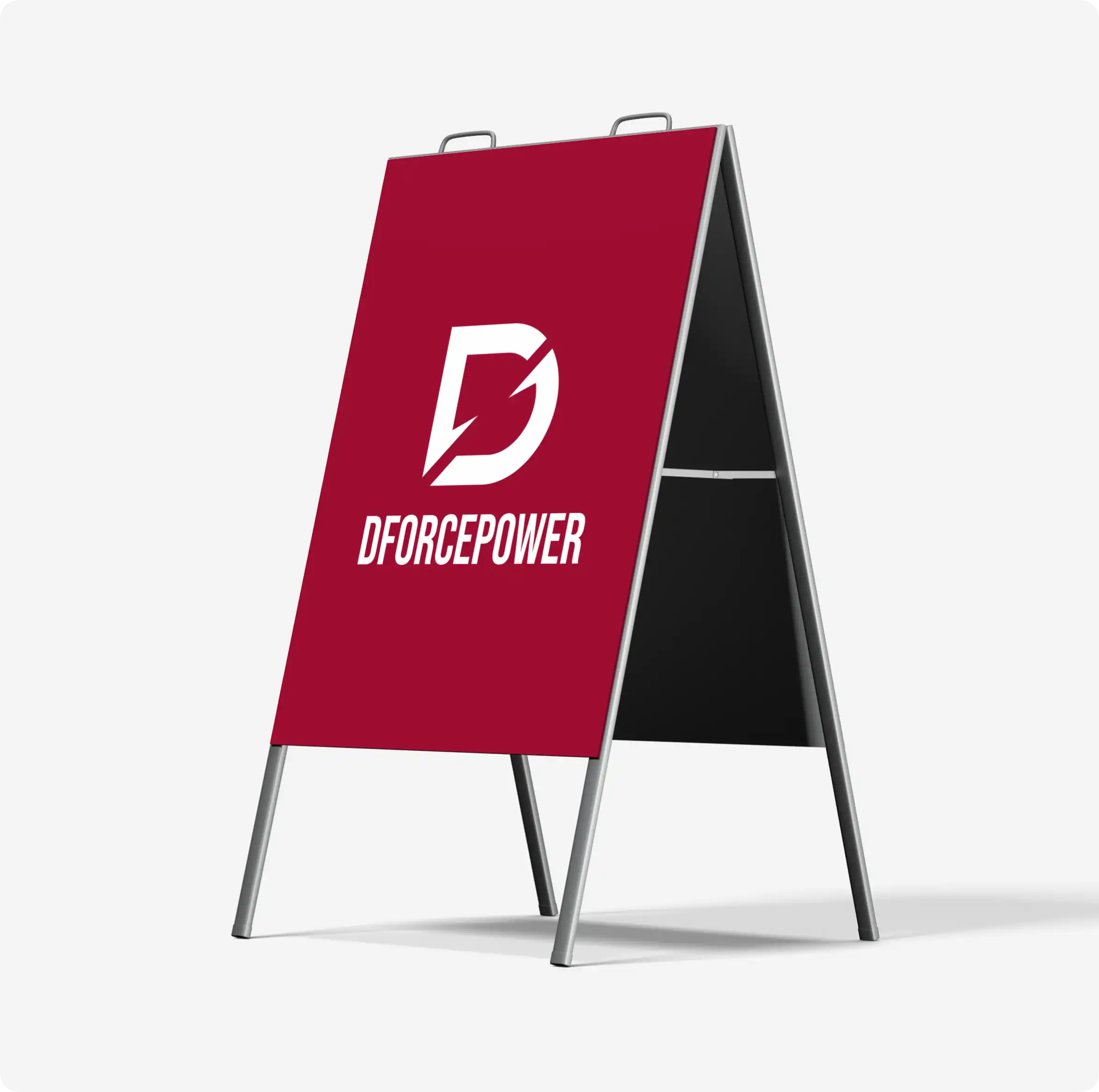
Visual Identity System
The visual identity is designed to create a bold, modern, and performance-driven brand presence. A strong and refined color palette represents technology, power, and premium automotive audio experiences, helping the brand stand out in the dealership industry. Supporting neutral tones provide clarity and balance while maintaining usability across different platforms and applications. The typography is clean, impactful, and highly legible, reinforcing reliability and professionalism. Together, these elements create a cohesive visual system that is scalable, adaptable, and consistent across all brand touchpoints.