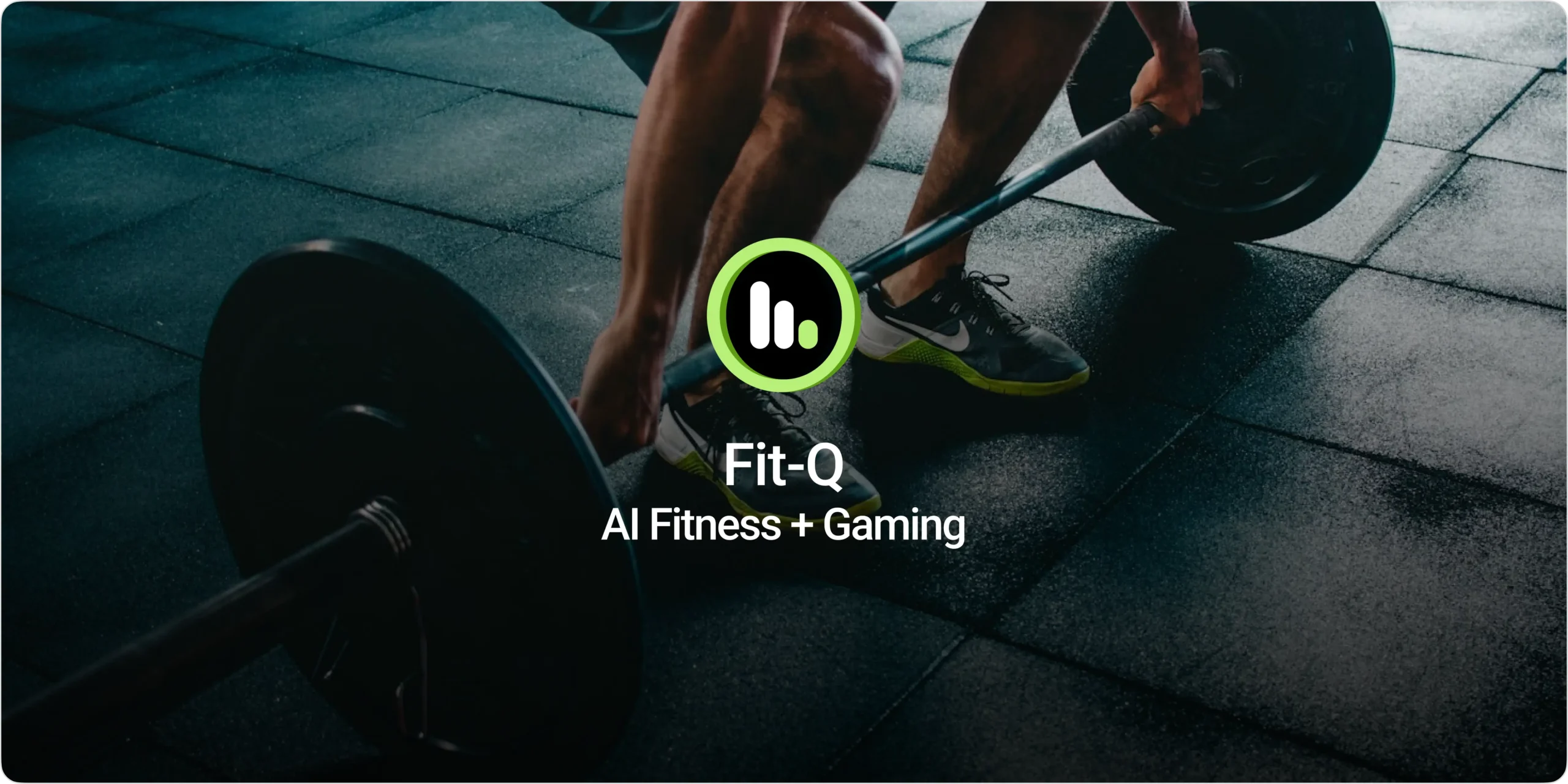
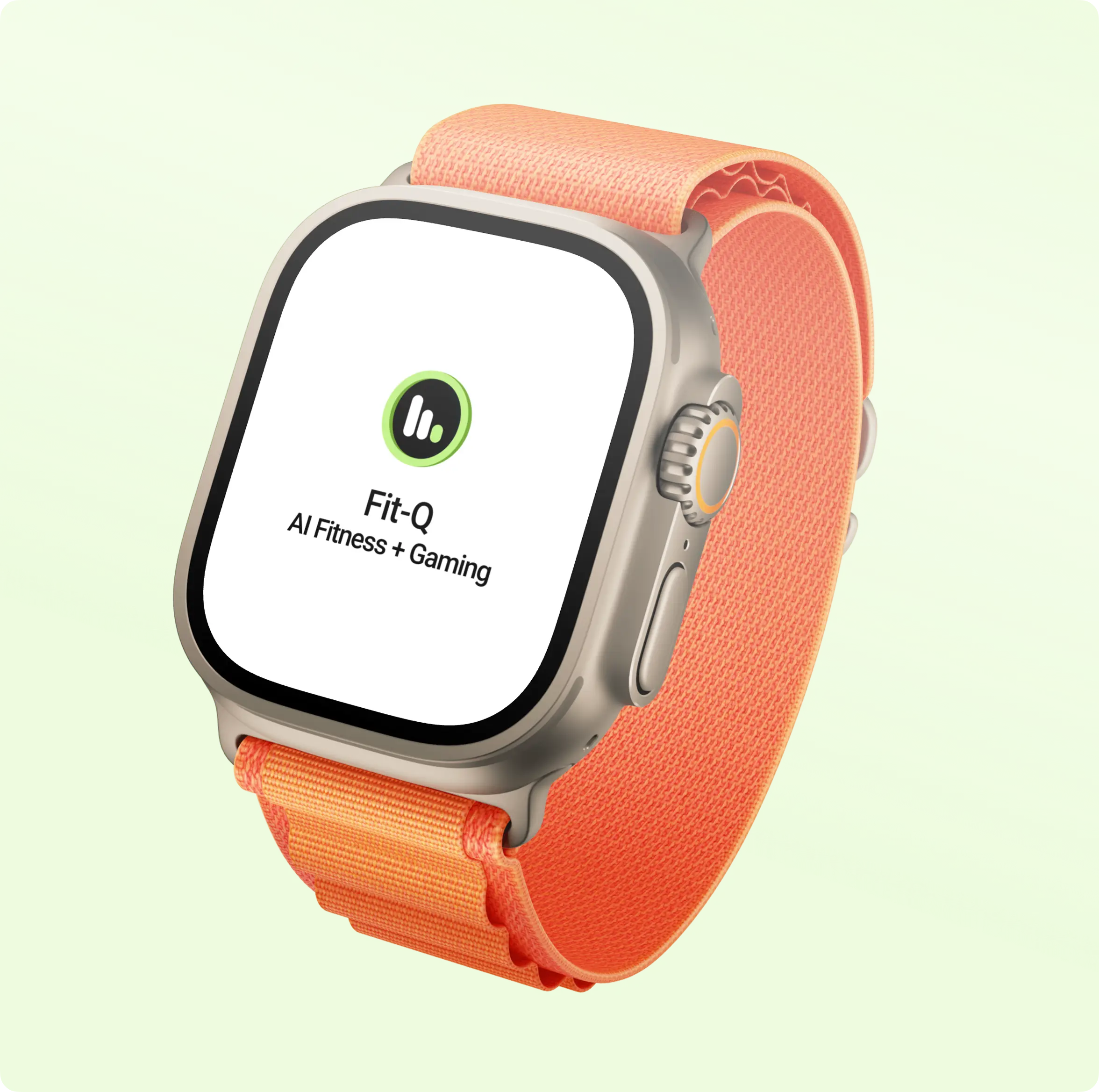
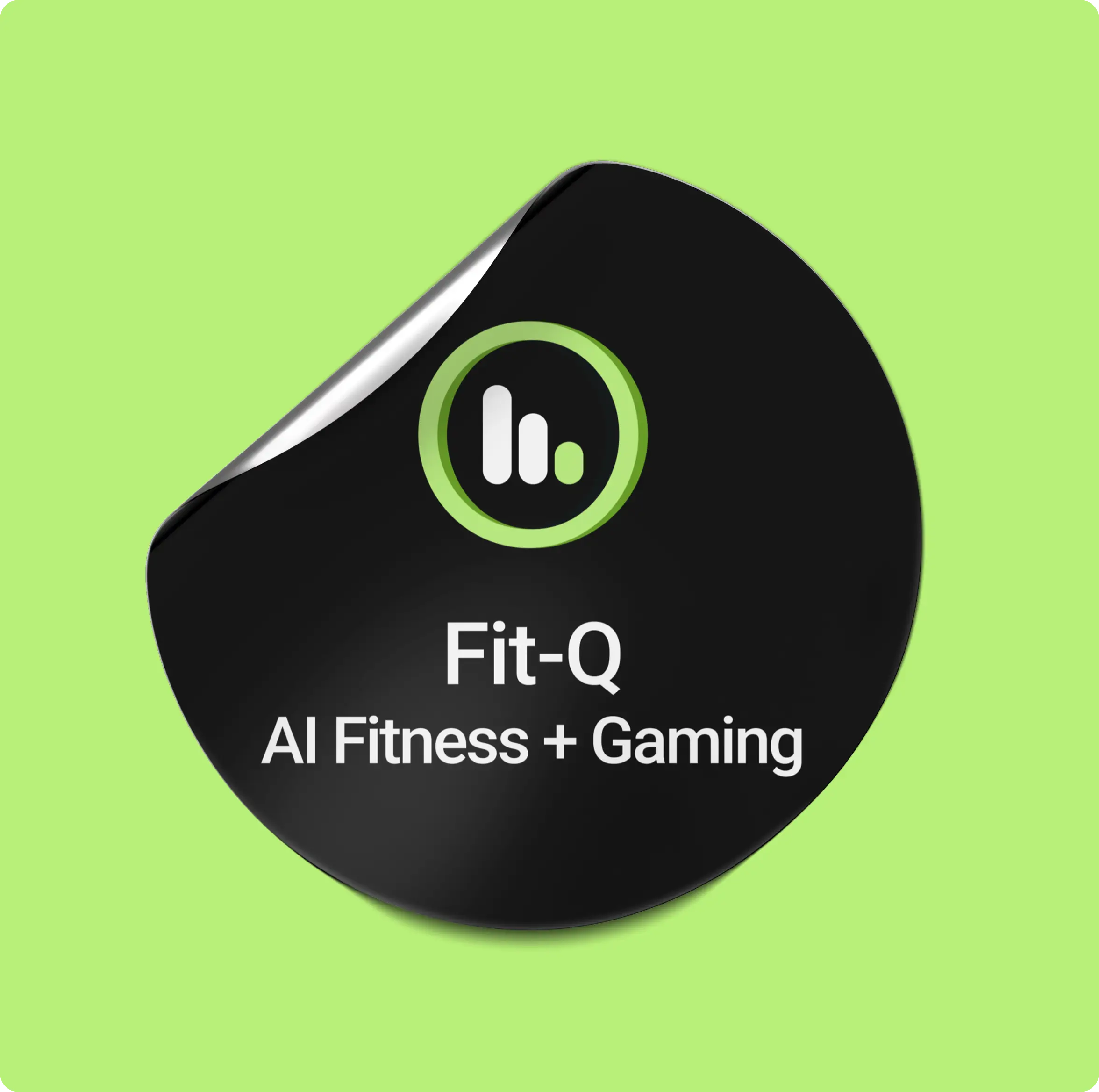
Fit-Q is a modern fitness platform designed for people who value health, performance, and consistent workout routines. The goal of the project was to create a streamlined digital experience that helps users manage workouts, track fitness progress, and stay motivated through a structured and engaging system. From guided exercises and workout tracking to personalized fitness experiences, the platform simplifies complex fitness journeys into a clear and user-friendly experience. The branding reflects this vision through a bold and energetic visual identity that communicates strength, movement, and scalability across all digital touchpoints.
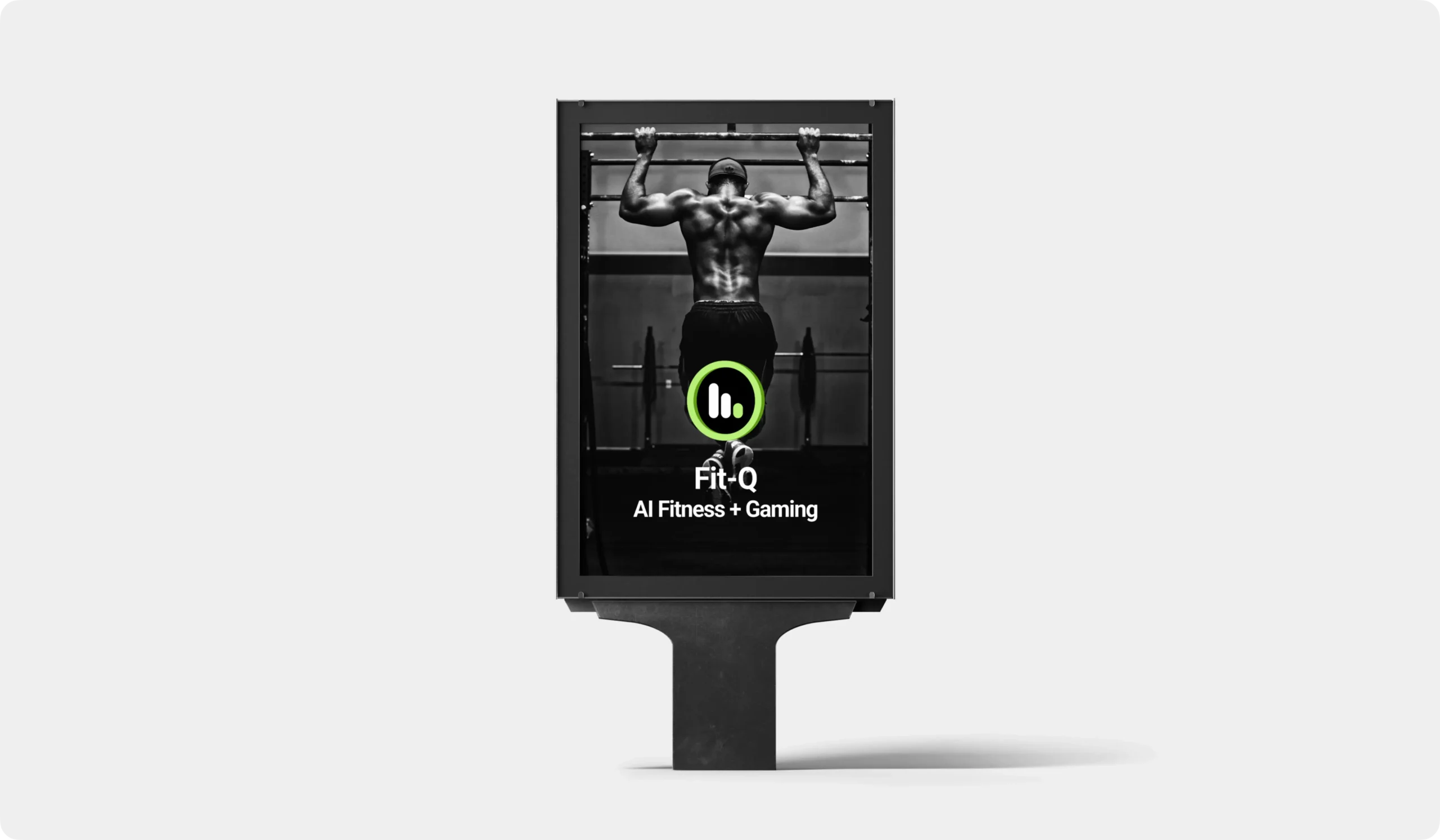
Logo Design & Concept
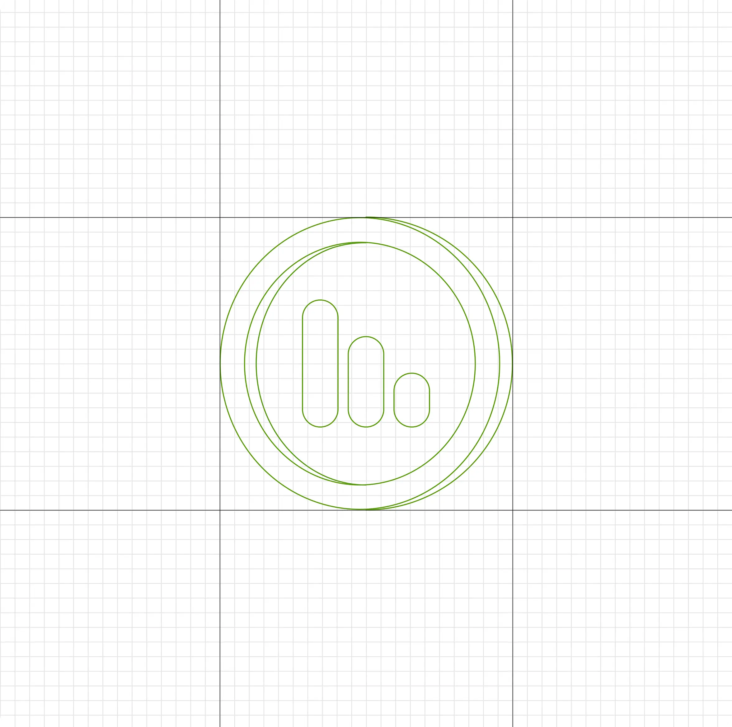
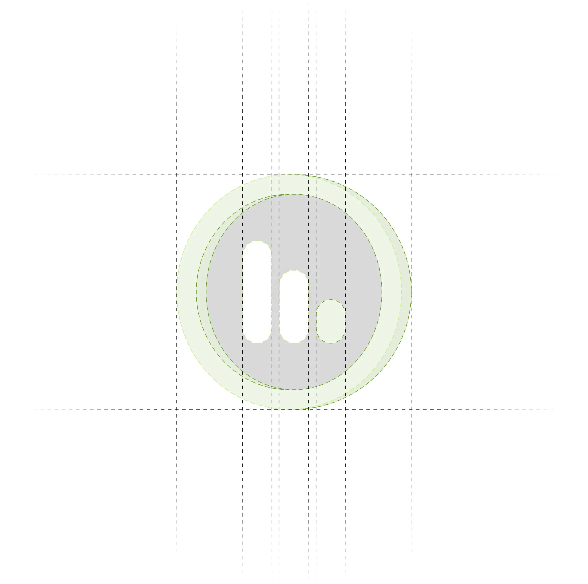
The logo is designed using a bold and dynamic form that represents strength, movement, and continuous fitness progress. The symbol reflects the connection between workouts, performance tracking, and healthy lifestyle goals, creating a visual identity that communicates energy and motivation. Its sharp geometry and balanced structure convey discipline, power, and forward movement while maintaining a clean and modern appearance. The design is intentionally minimal yet impactful, allowing it to adapt seamlessly across mobile interfaces, fitness branding, and digital applications while maintaining a strong and recognizable identity.
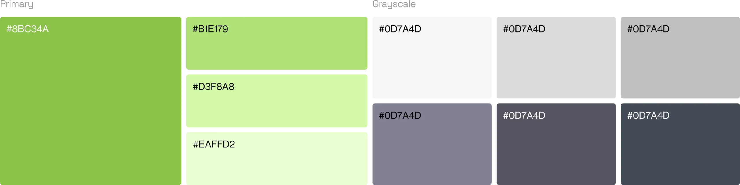
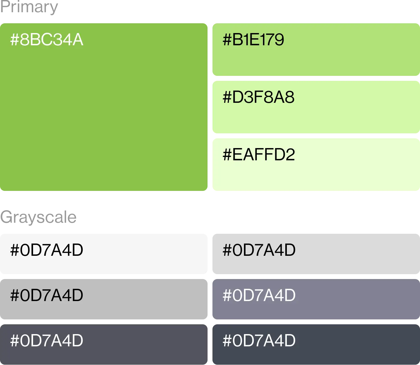
Color Palette
The color palette is built around bold and energetic tones that represent strength, motivation, and active lifestyles. It creates a powerful visual identity while helping the brand stand out within the competitive fitness and wellness industry. Supporting neutral shades maintain balance, readability, and consistency across mobile interfaces, workout experiences, and branding applications.
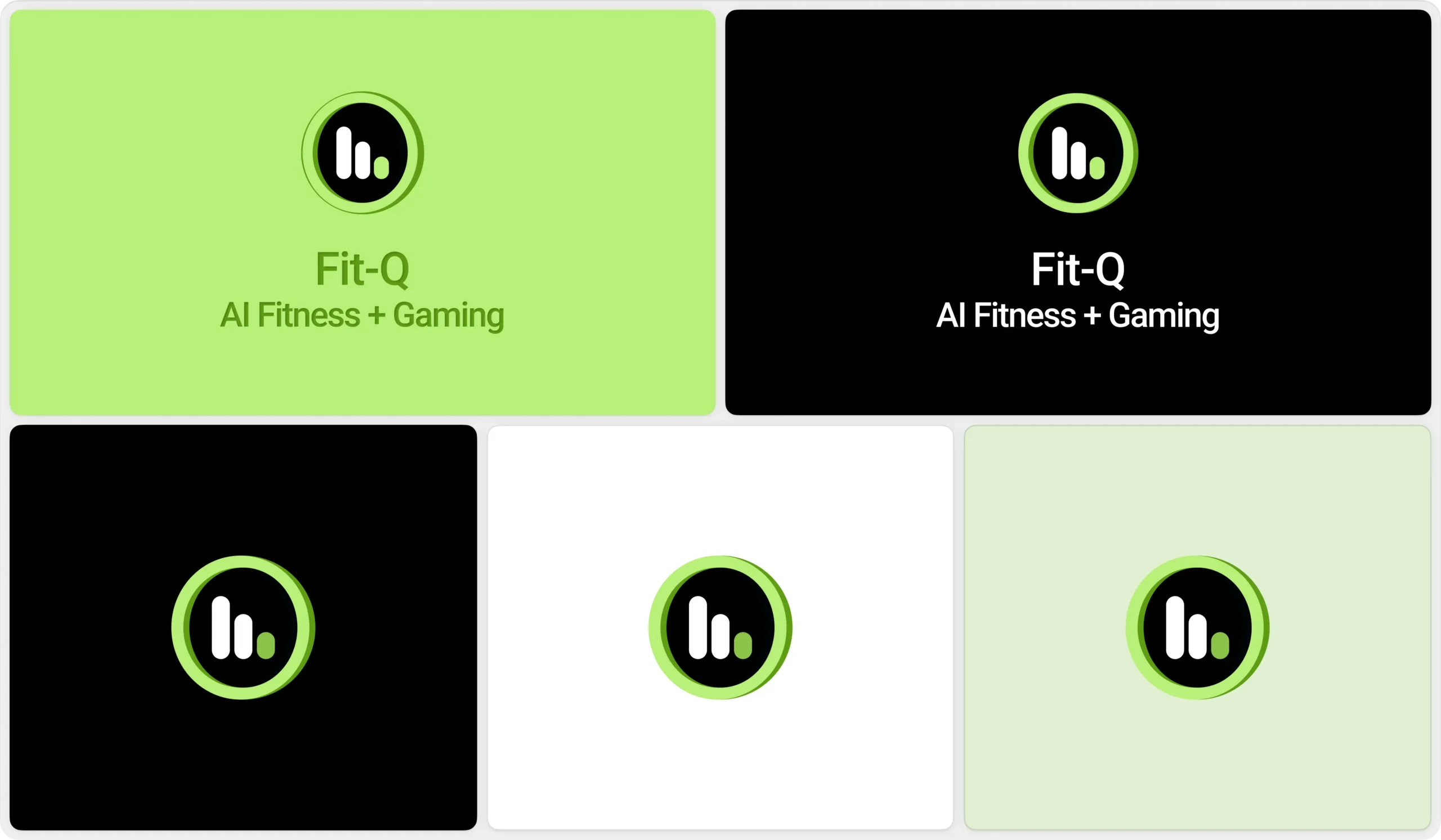
Visual Identity System
The visual identity is designed to create a bold, modern, and performance-driven brand presence. An energetic and refined color palette represents strength, movement, and healthy lifestyles, helping the brand stand out within the fitness and wellness industry. Supporting neutral tones provide balance and clarity while maintaining consistency across mobile interfaces and digital experiences. The typography is clean, modern, and highly readable, reinforcing motivation and reliability. Together, these elements create a cohesive visual system that is adaptable, scalable, and consistent across all brand touchpoints.