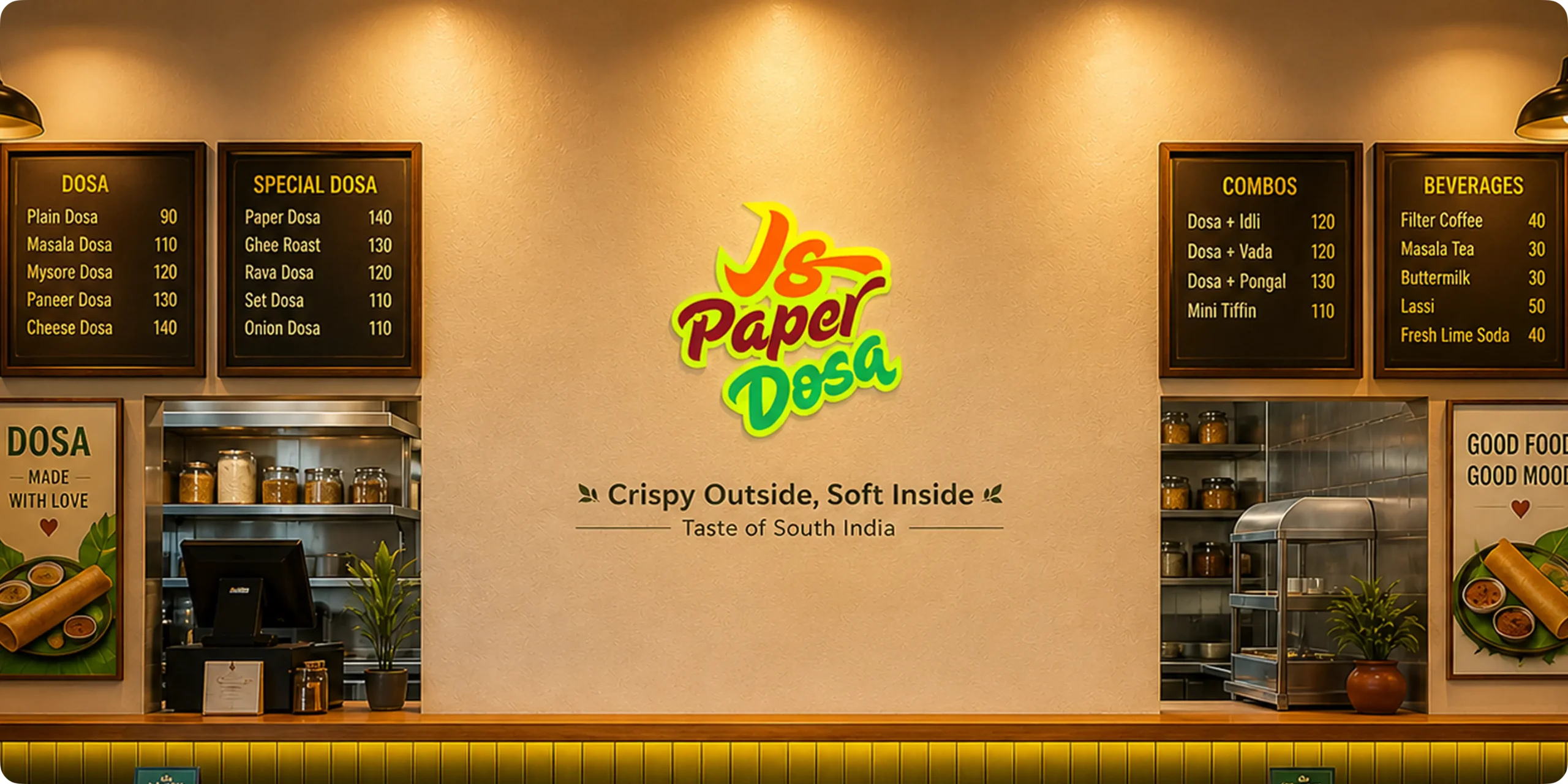
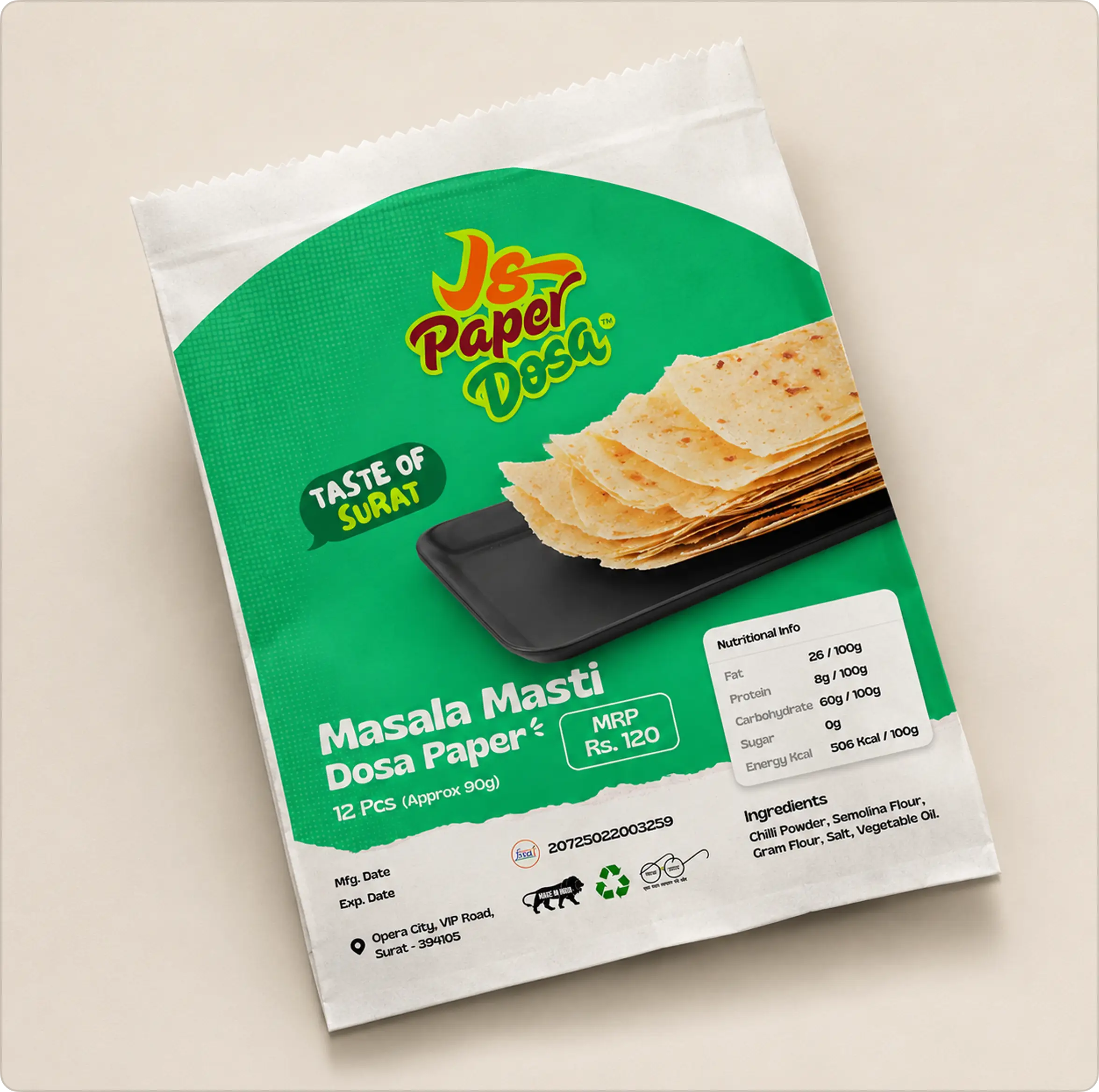
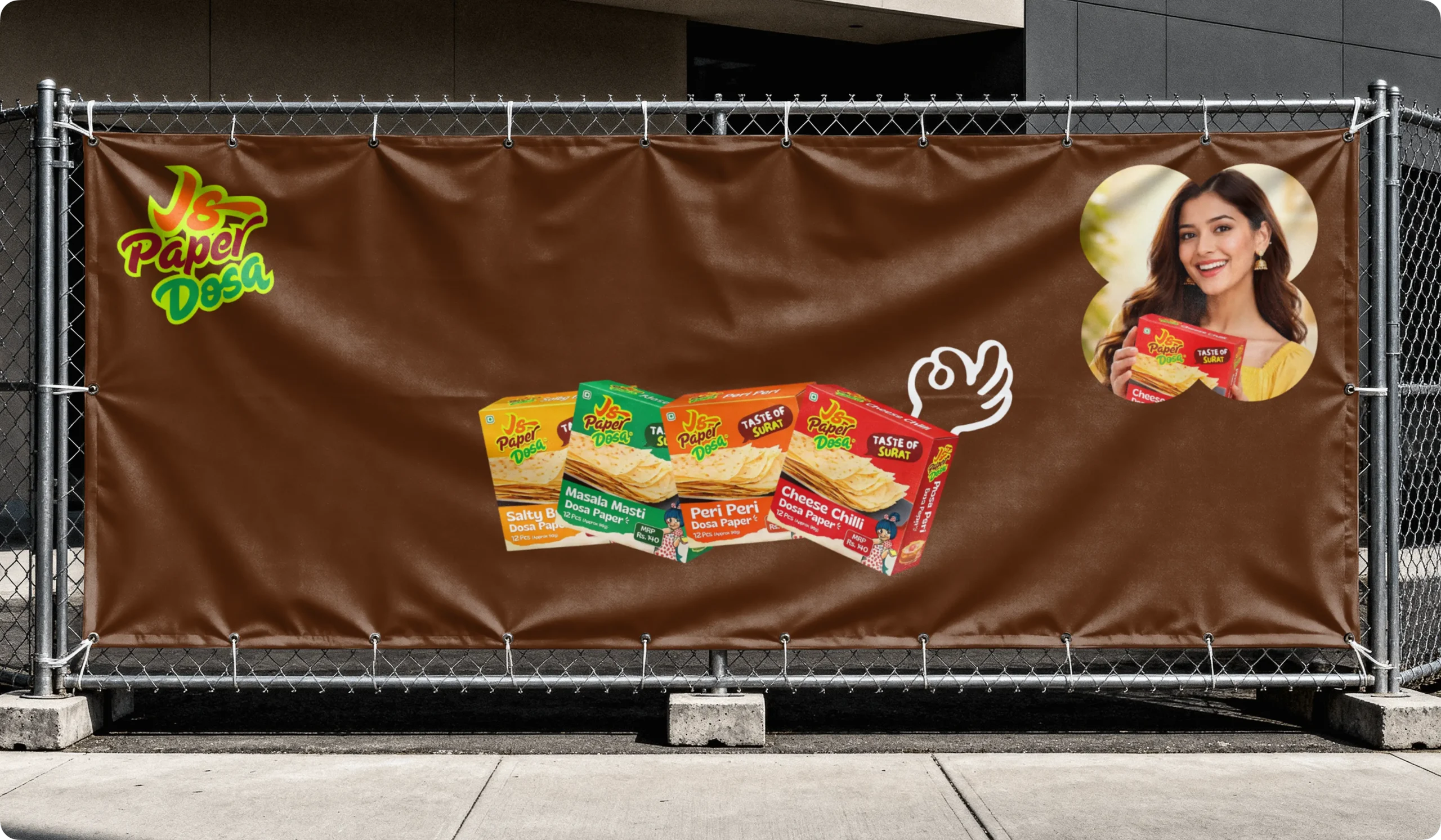
JS Paper Dosa is a modern food and beverage platform designed for customers and dealers who value quality, convenience, and authentic South Indian flavors. The goal of the project was to create a streamlined digital experience that simplifies both wholesale and retail paper dosa ordering through a clean and user-friendly system. From showcasing dosa products to managing bulk inquiries and retail orders, the platform transforms traditional food ordering processes into a smooth and engaging experience. The branding reflects this vision through a warm and modern visual identity that communicates freshness, authenticity, and scalability across all touchpoints.
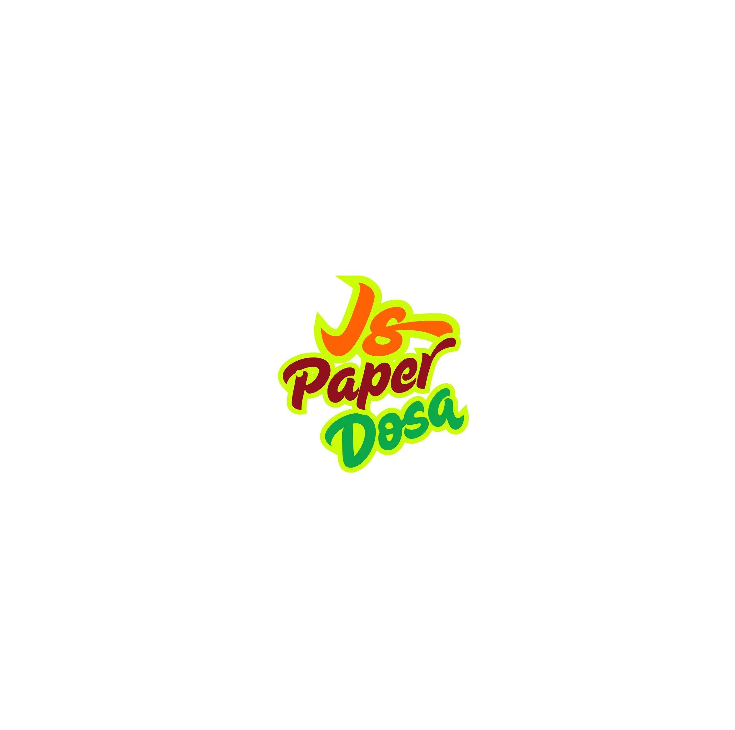
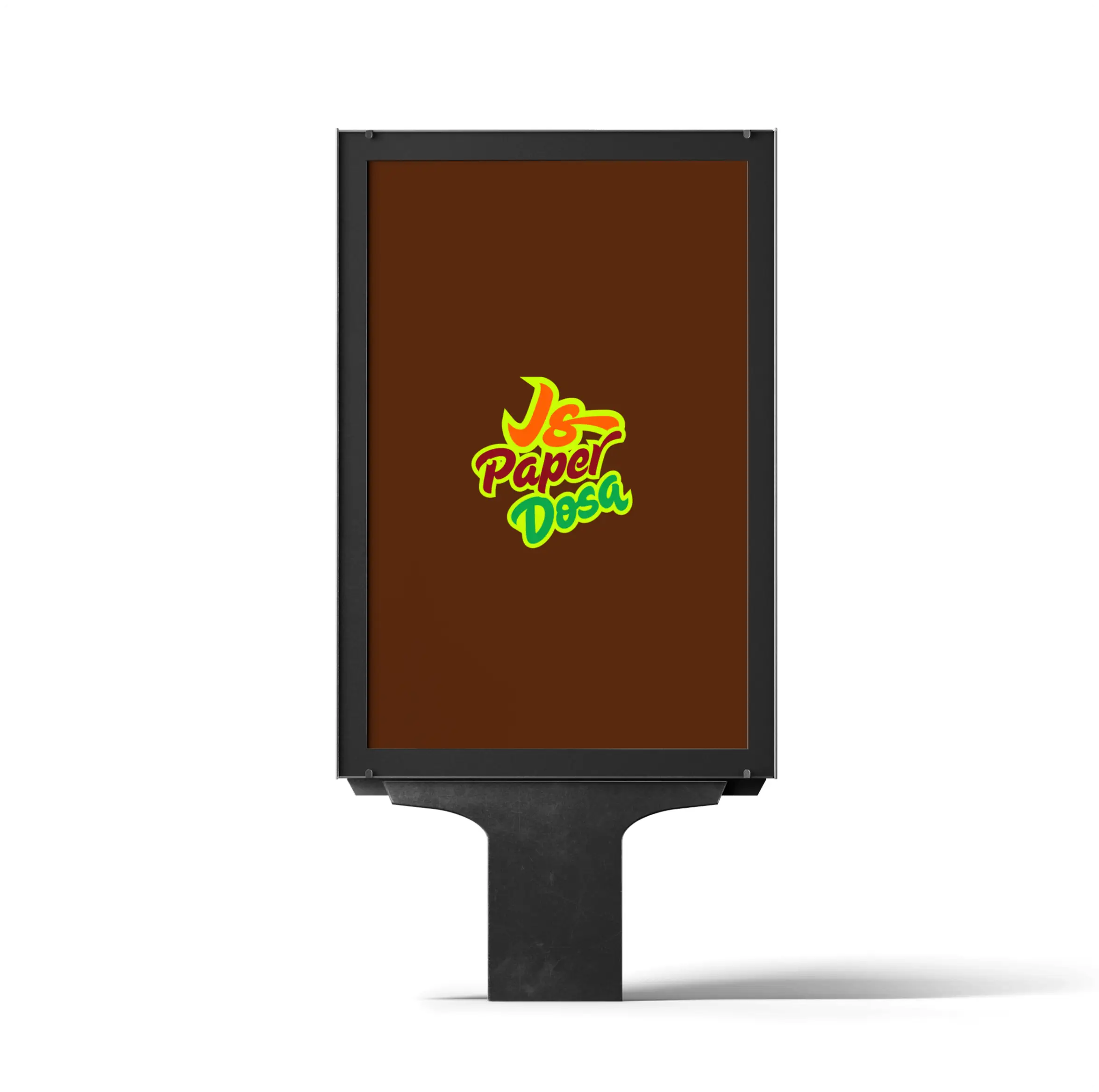
Logo Design & Concept
The logo is designed using a clean and balanced form that represents freshness, authenticity, and the traditional essence of South Indian cuisine. The symbol reflects the connection between quality food experiences, wholesale distribution, and modern ordering systems, creating a visual identity that communicates trust and simplicity. Its smooth curves and structured composition convey warmth, movement, and consistency while maintaining a modern and approachable appearance. The design is intentionally minimal yet memorable, allowing it to adapt seamlessly across food packaging, digital platforms, and branding applications while maintaining a strong and recognizable identity.
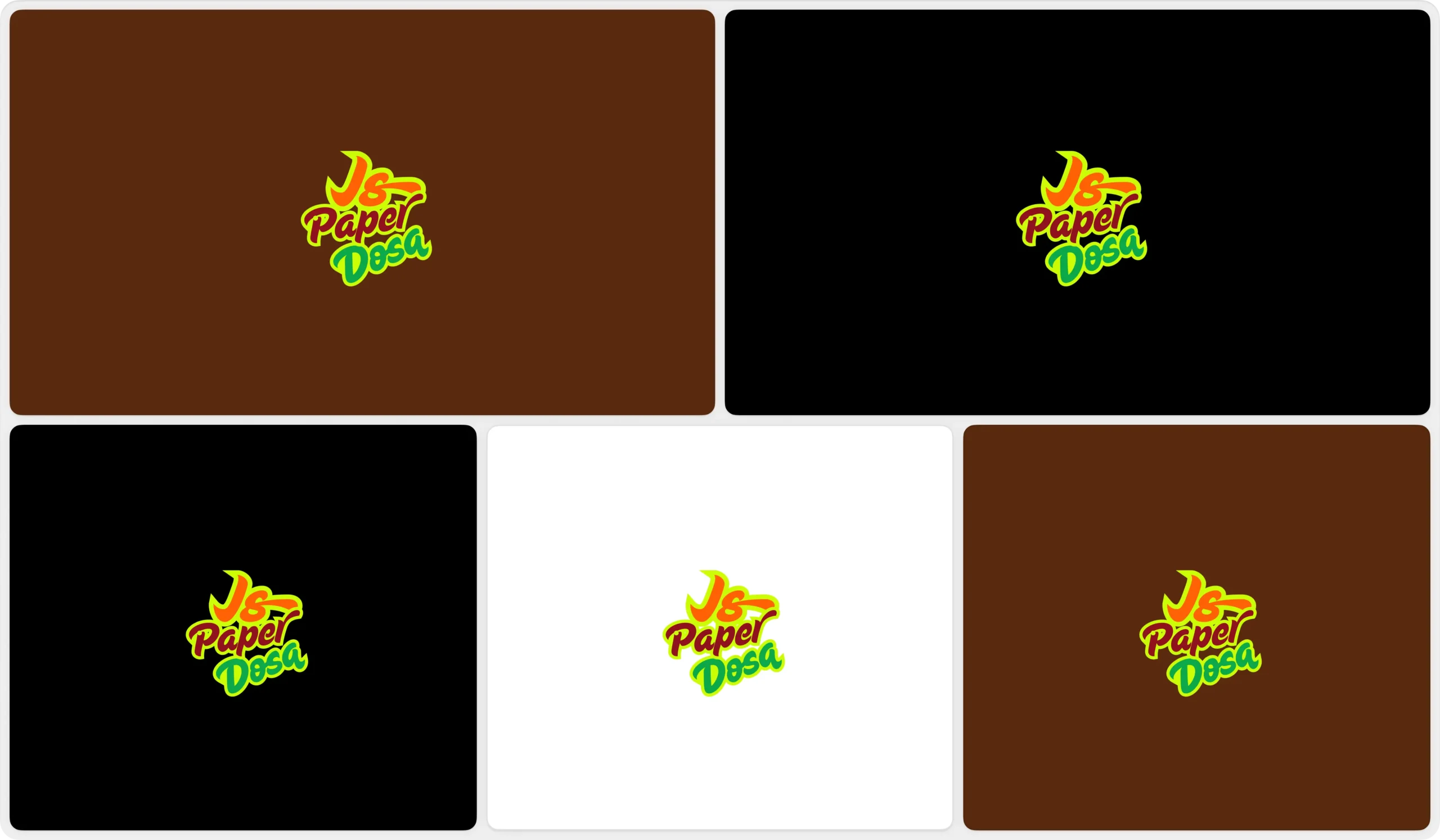
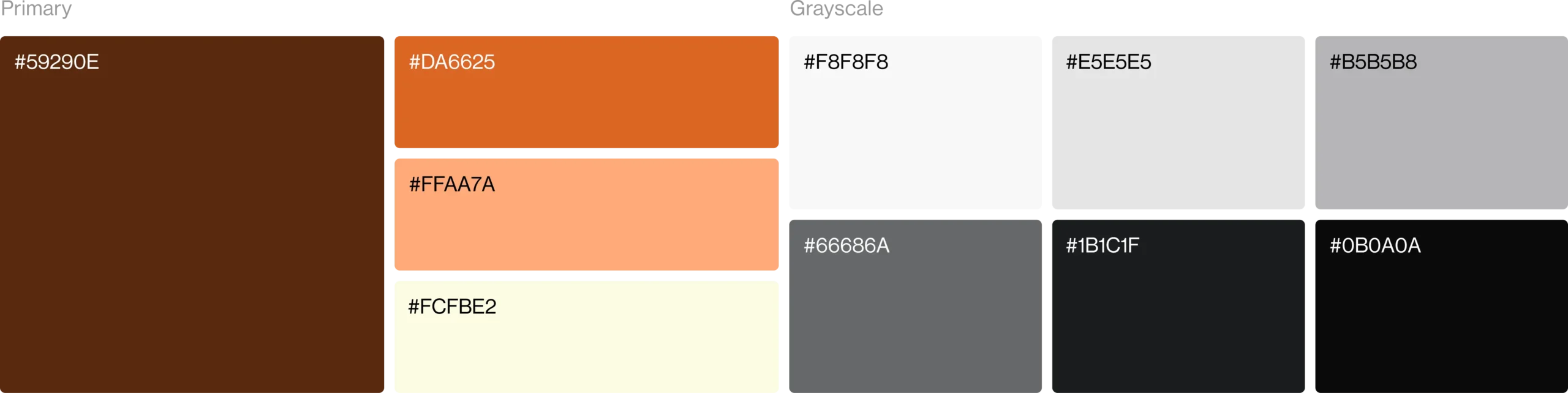
Color Palette
The color palette is built around warm and appetizing tones that represent freshness, authenticity, and traditional food experiences. It creates a welcoming visual identity while helping the brand stand out within the food and beverage industry. Supporting neutral shades maintain balance, readability, and consistency across packaging, digital platforms, and branding applications.
Visual Identity System
The visual identity is designed to create a warm, modern, and food-focused brand presence. A refined and appetizing color palette represents freshness, authenticity, and quality food experiences, helping the brand stand out within the food and beverage industry. Supporting neutral tones provide balance and clarity while maintaining consistency across packaging and digital platforms. The typography is clean, modern, and highly readable, reinforcing trust and accessibility. Together, these elements create a cohesive visual system that is adaptable, scalable, and consistent across all brand touchpoints.