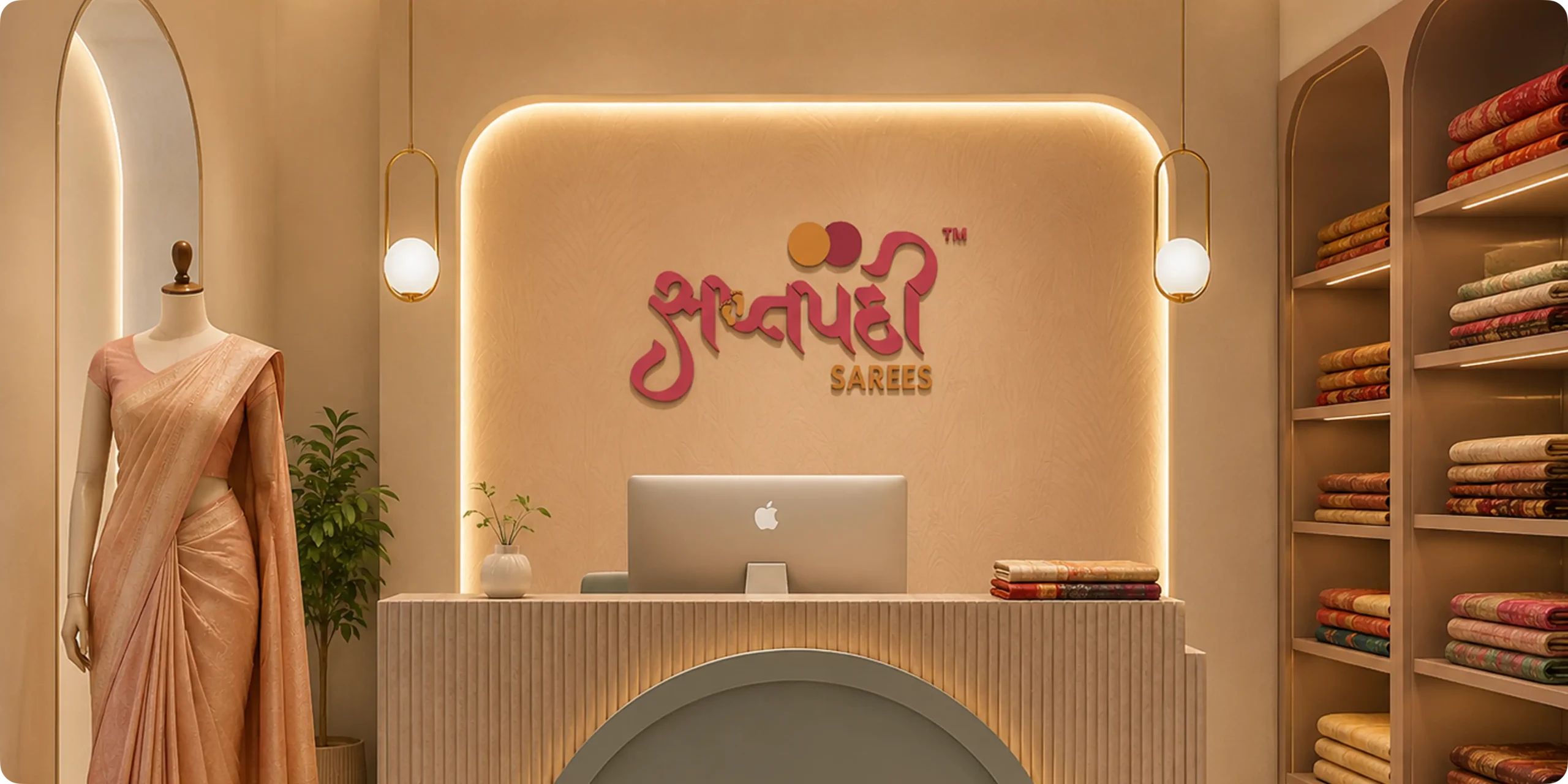
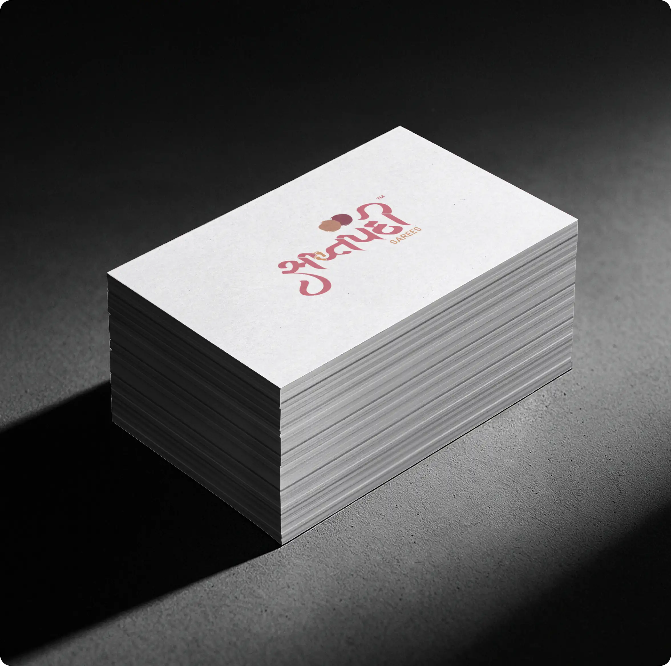
SaptapadiSarees is a premium ecommerce fashion platform designed for women who value elegance, tradition, and timeless style. The goal of the project was to create a refined digital shopping experience that showcases exclusive saree collections through a clean and visually sophisticated system. From exploring premium designs to discovering detailed craftsmanship and modern ethnic fashion, the platform transforms traditional saree shopping into a seamless and luxurious experience. The branding reflects this vision through an elegant visual identity that communicates grace, exclusivity, and sophistication across all digital touchpoints.
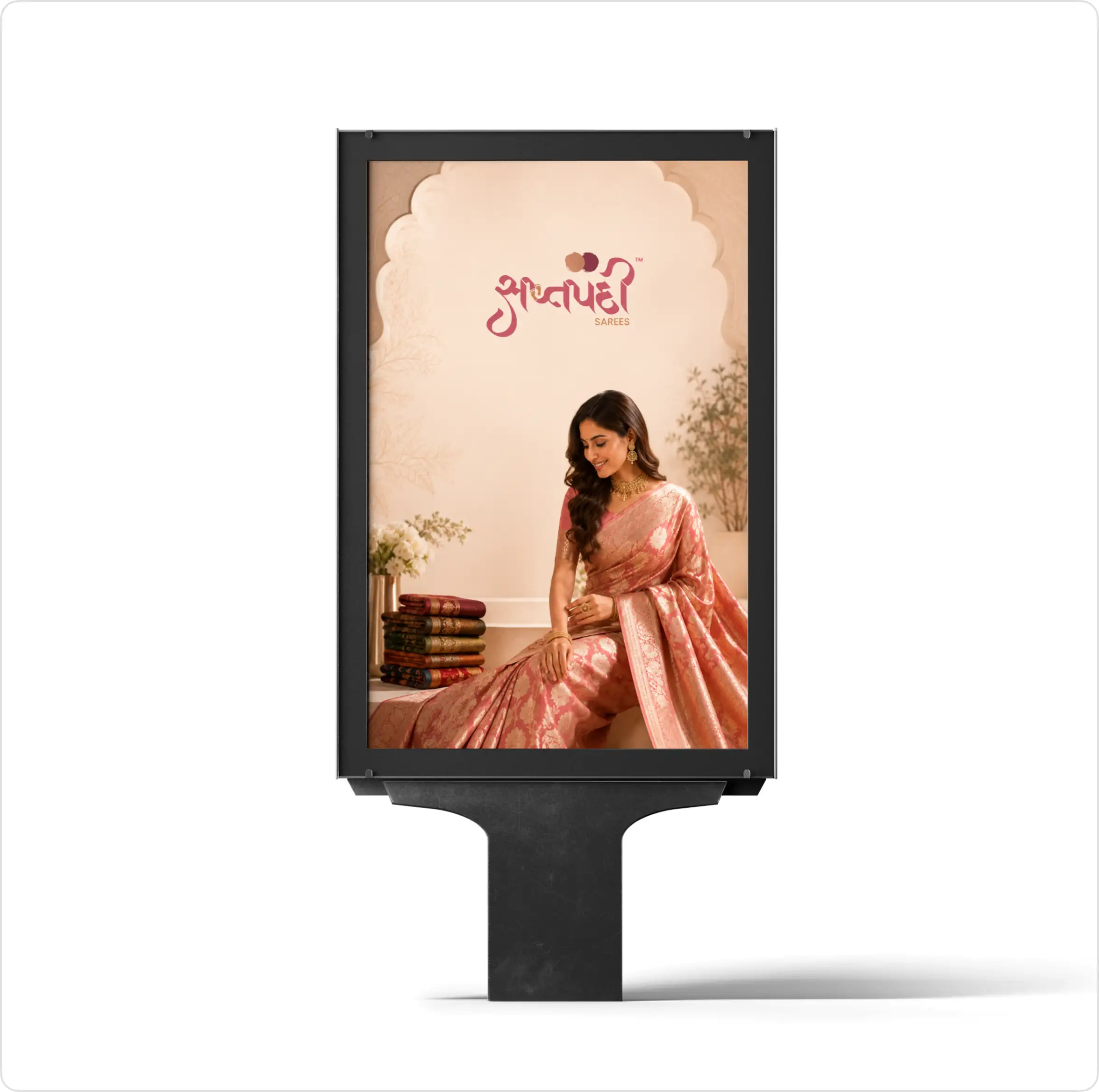
Logo Design & Concept
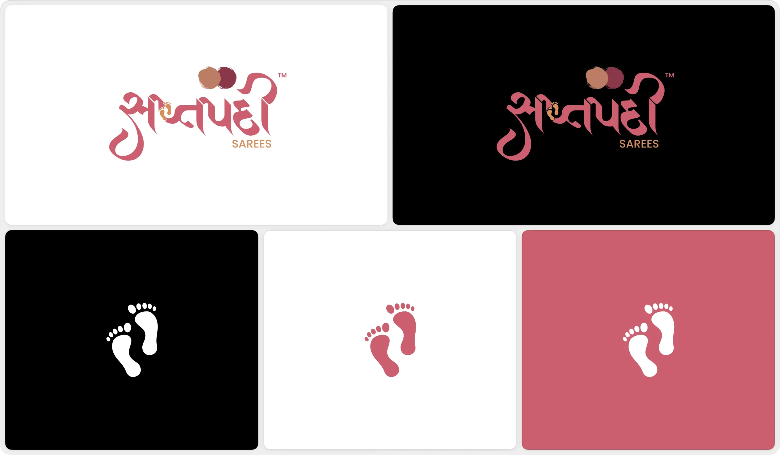
The logo is designed using a graceful and refined form that represents elegance, tradition, and timeless craftsmanship. The symbol reflects the connection between premium saree fashion, cultural heritage, and modern luxury experiences, creating a visual identity that communicates sophistication and trust. Its smooth curves and balanced structure convey femininity, movement, and exclusivity while maintaining a clean and premium appearance. The design is intentionally minimal yet expressive, allowing it to scale seamlessly across ecommerce platforms, fashion packaging, and branding applications while maintaining a strong and recognizable identity.
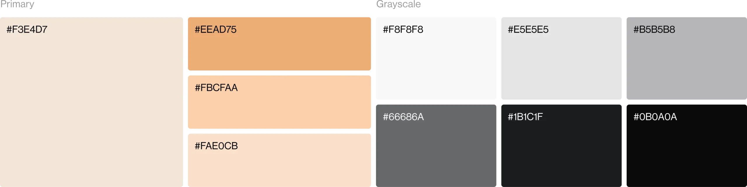
Color Palette
The color palette is built around elegant and luxurious tones that represent grace, femininity, and timeless fashion. It creates a refined visual identity while helping the brand stand out within the premium saree and ethnic fashion industry. Supporting neutral shades maintain balance, readability, and consistency across ecommerce platforms, packaging, and branding applications.
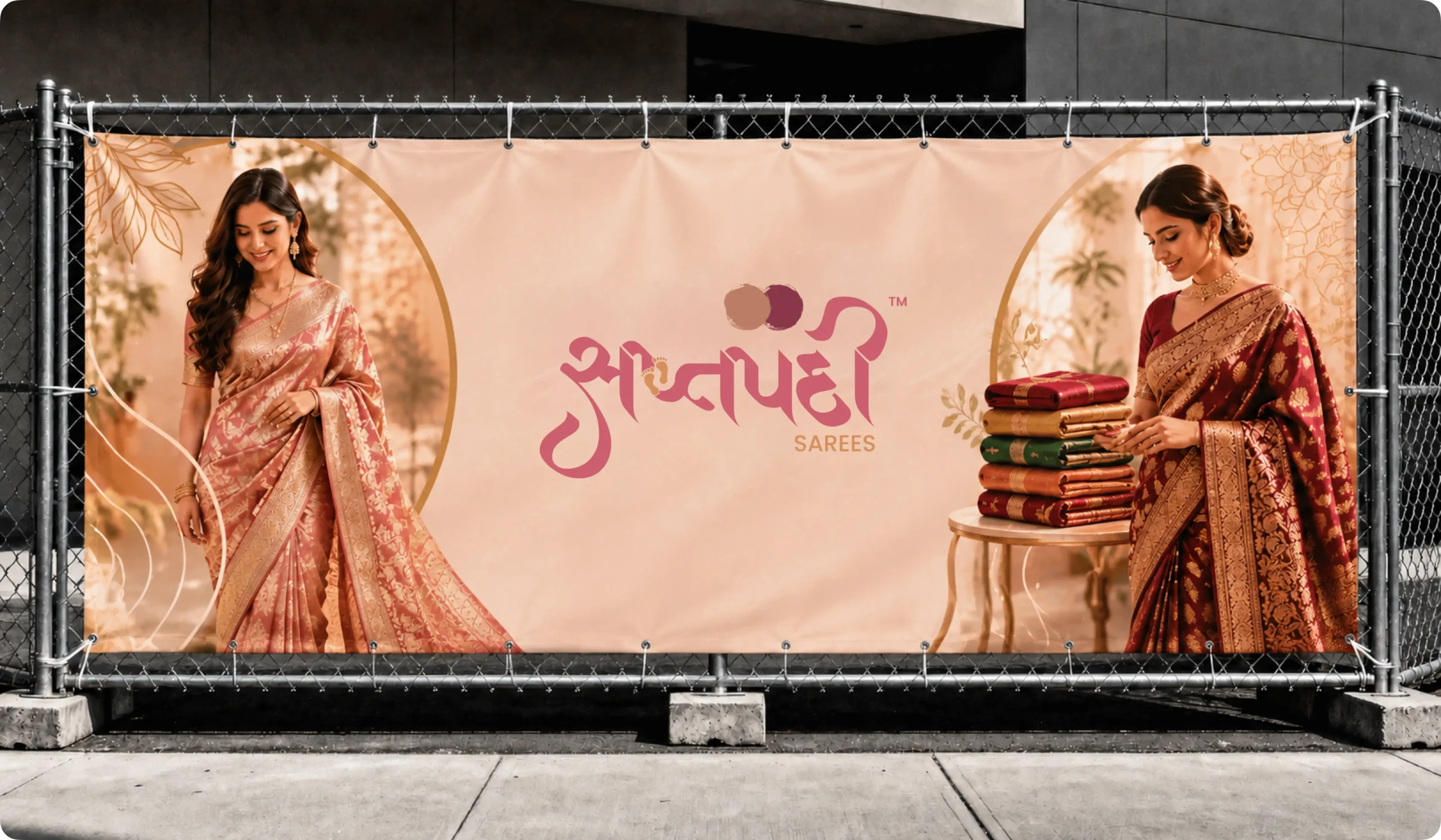
Visual Identity System
The visual identity is designed to create an elegant, luxurious, and fashion-focused brand presence. A refined and premium color palette represents grace, sophistication, and timeless ethnic fashion, helping the brand stand out within the premium saree industry. Supporting neutral tones provide balance and clarity while maintaining consistency across ecommerce platforms and packaging experiences. The typography is clean, graceful, and highly readable, reinforcing trust and premium craftsmanship. Together, these elements create a cohesive visual system that is adaptable, scalable, and consistent across all brand touchpoints.