Aavkar Steel Corp. is a modern construction materials brand focused on delivering strength, reliability, and quality for the infrastructure industry. The goal of the project was to create a strong and professional visual identity that represents the company’s expertise in TMT bars, cement, and construction-related products. From logo design to social media branding, the project was built to establish a bold and trustworthy market presence through clear and impactful communication. The branding reflects this vision through a powerful visual identity that communicates durability, confidence, and scalability across all digital and promotional touchpoints.
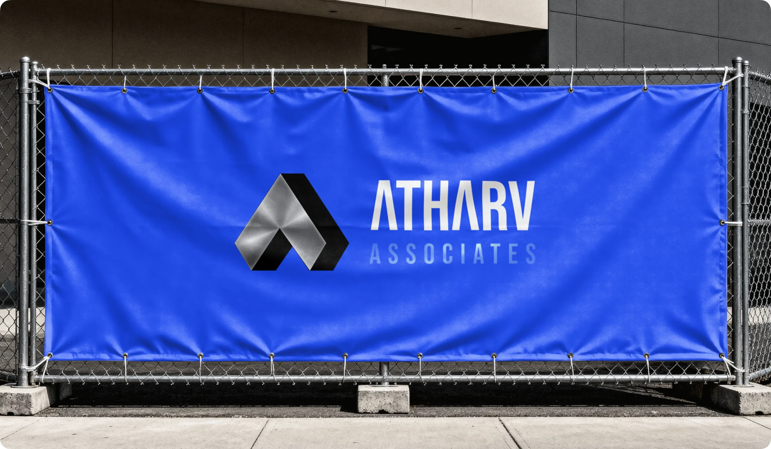
Logo Design & Concept
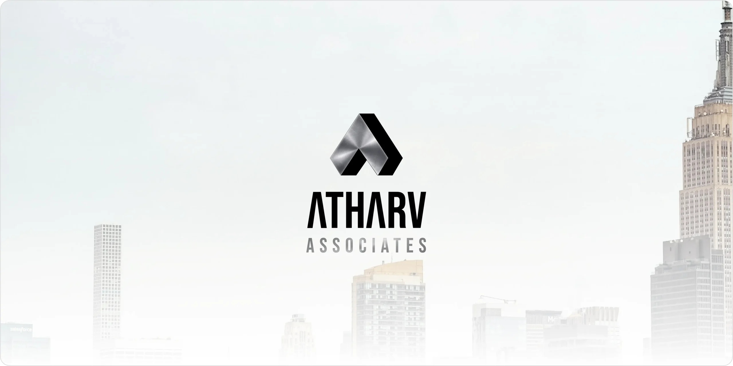
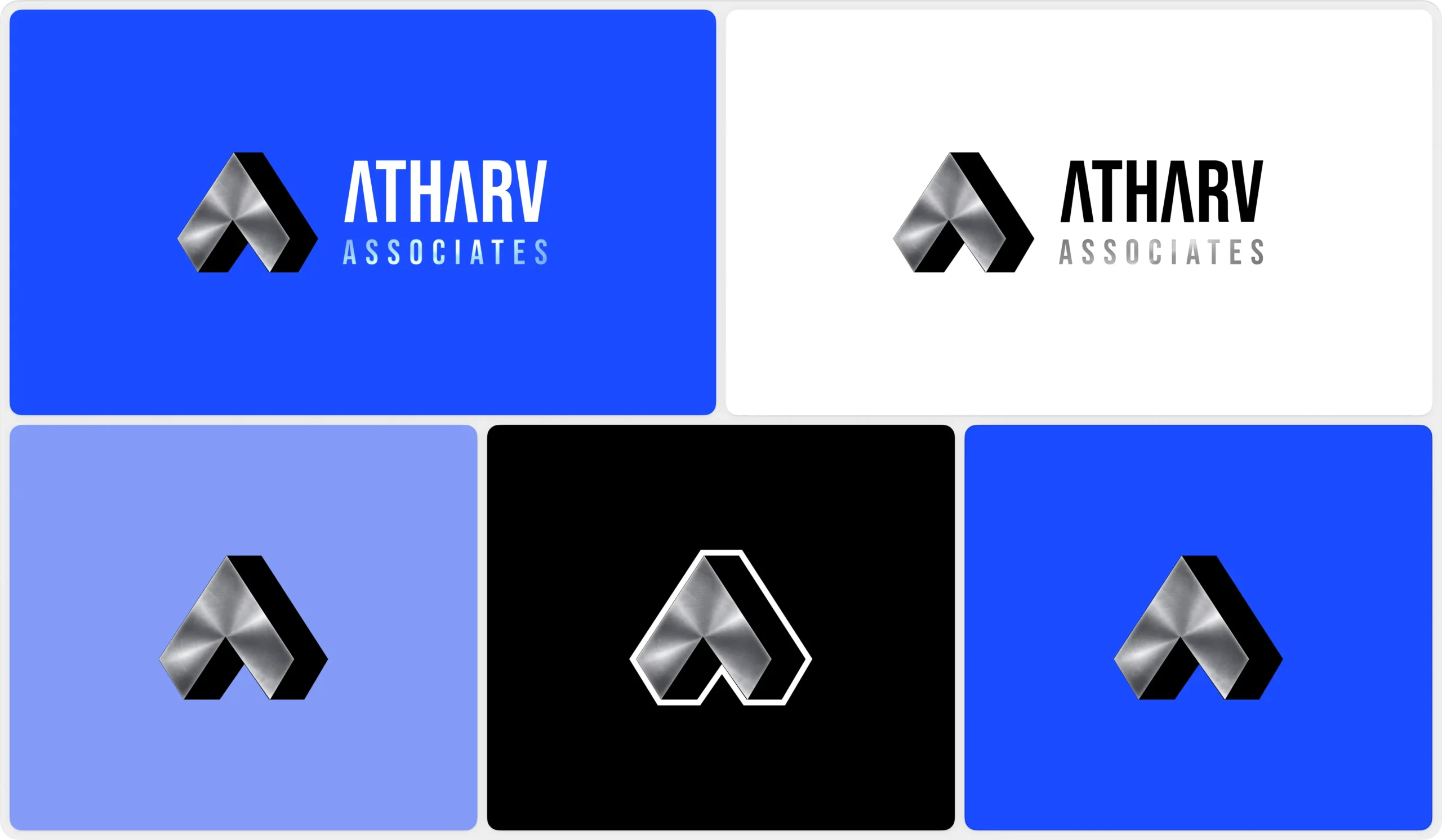
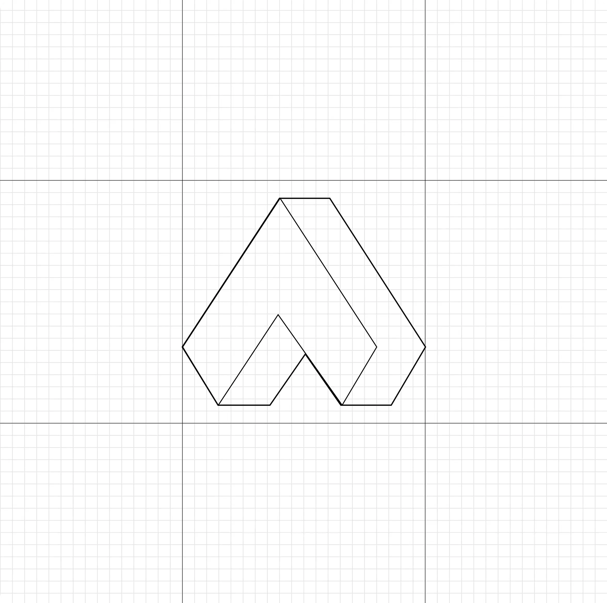
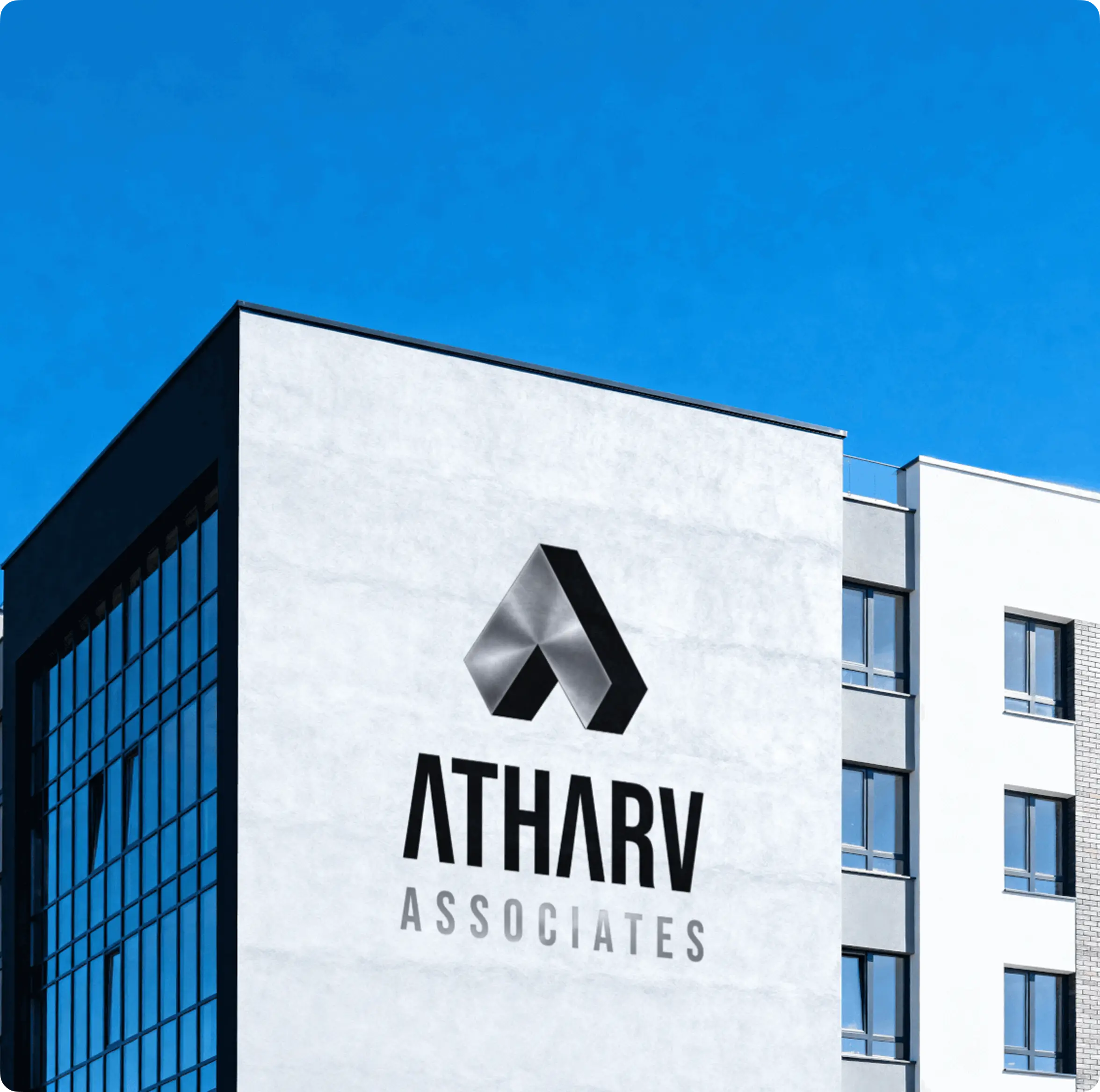
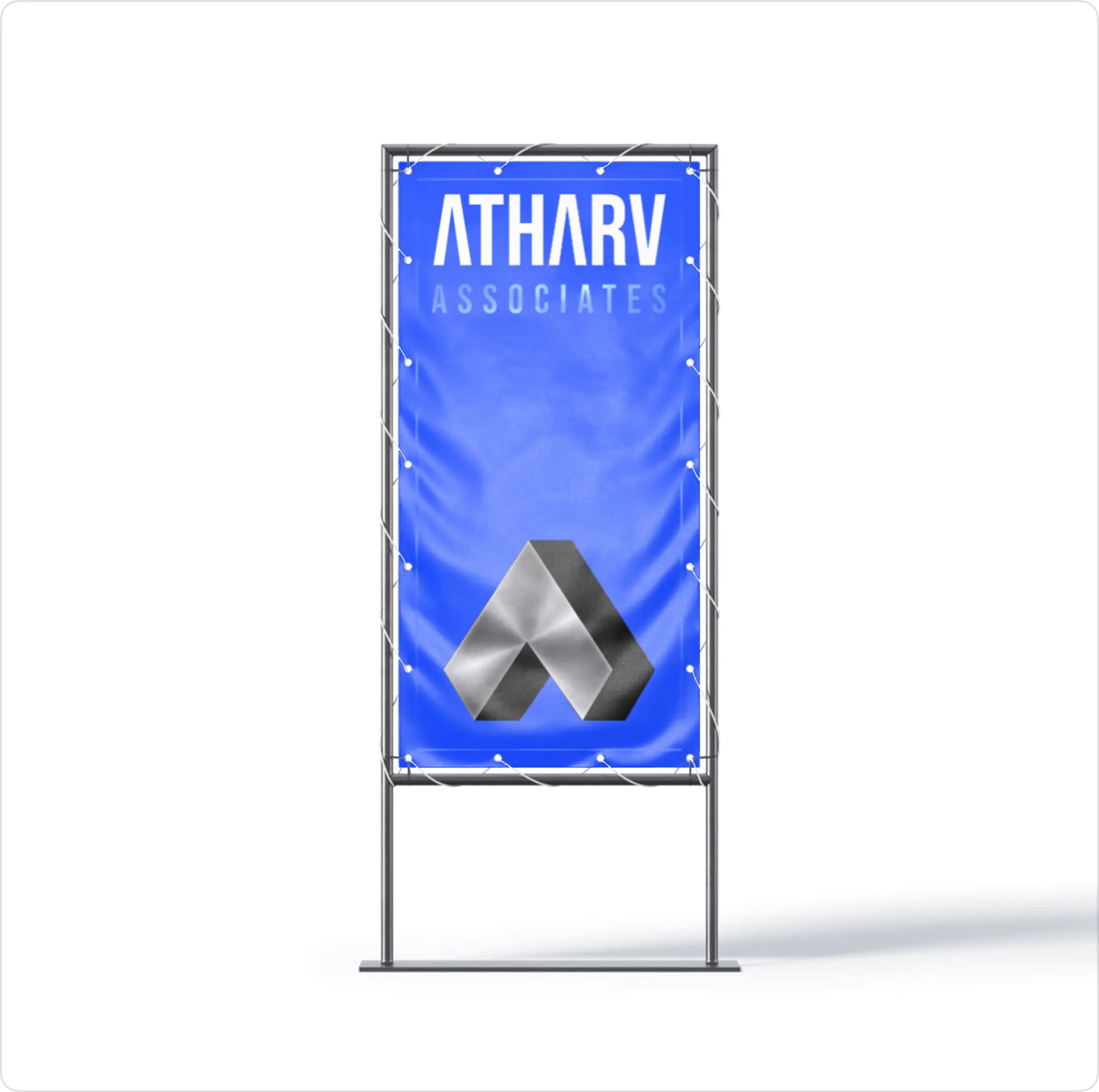
The logo is designed using a bold and structured form that represents strength, stability, and industrial reliability. The symbol reflects the connection between construction materials, infrastructure growth, and modern business values, creating a visual identity that communicates trust and durability. Its sharp geometry and balanced composition convey power, progress, and long-term stability while maintaining a clean and professional appearance. The design is intentionally minimal yet impactful, allowing it to scale seamlessly across branding materials, social media applications, and corporate touchpoints while maintaining a strong and recognizable identity.
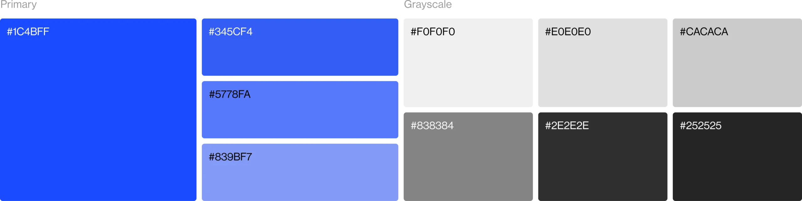
Color Palette
The color palette is built around bold and industrial tones that represent strength, durability, and construction reliability. It creates a powerful visual identity while helping the brand stand out within the steel and construction materials industry. Supporting neutral shades maintain balance, readability, and consistency across branding materials, social media creatives, and digital applications.
Visual Identity System
The visual identity is designed to create a strong, modern, and industrial-focused brand presence. A bold and refined color palette represents durability, reliability, and infrastructure growth, helping the brand stand out within the steel and construction materials industry. Supporting neutral tones provide balance and clarity while maintaining consistency across social media creatives and branding materials. The typography is clean, bold, and highly readable, reinforcing professionalism and market trust. Together, these elements create a cohesive visual system that is adaptable, scalable, and consistent across all brand touchpoints.