Apptestify is a smart QA testing platform designed for modern digital products, where performance, reliability, and user experience are essential. The goal of the project was to simplify the testing process by creating a streamlined system that connects testers, developers, and product teams in one efficient workflow. From testing mobile apps and games to software and IT products, the platform helps identify issues, improve usability, and ensure product quality with clarity and precision. The branding reflects this vision through a modern visual identity that communicates trust, innovation, and scalability across all digital touchpoints.
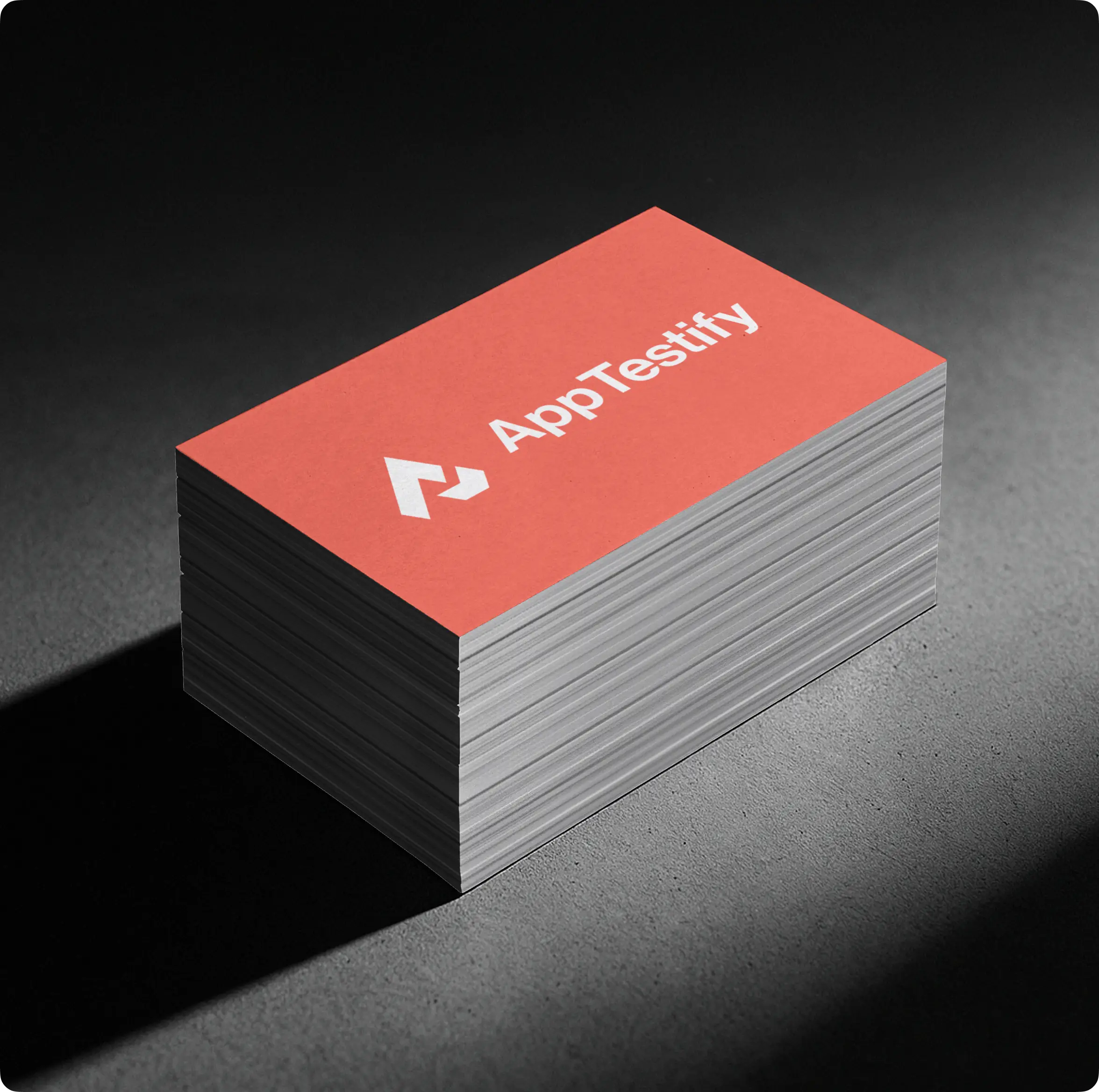
Logo Design & Concept
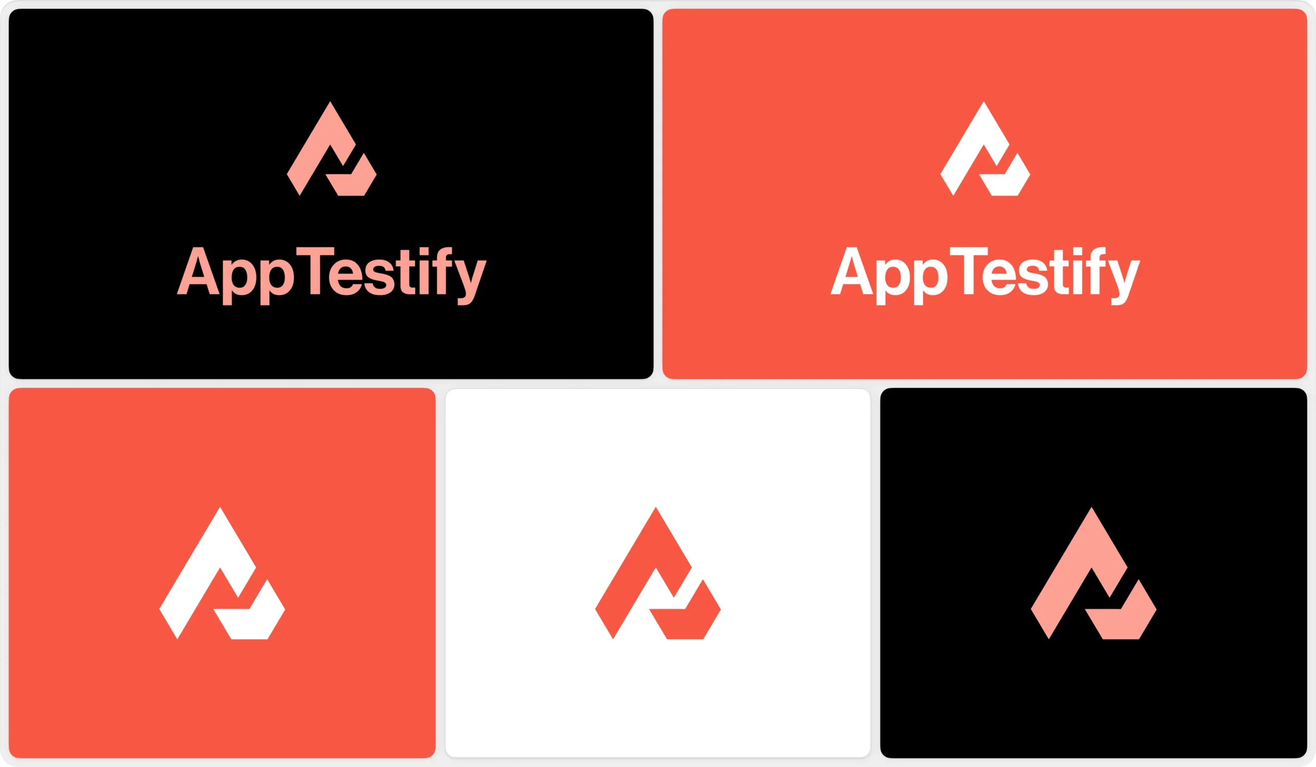
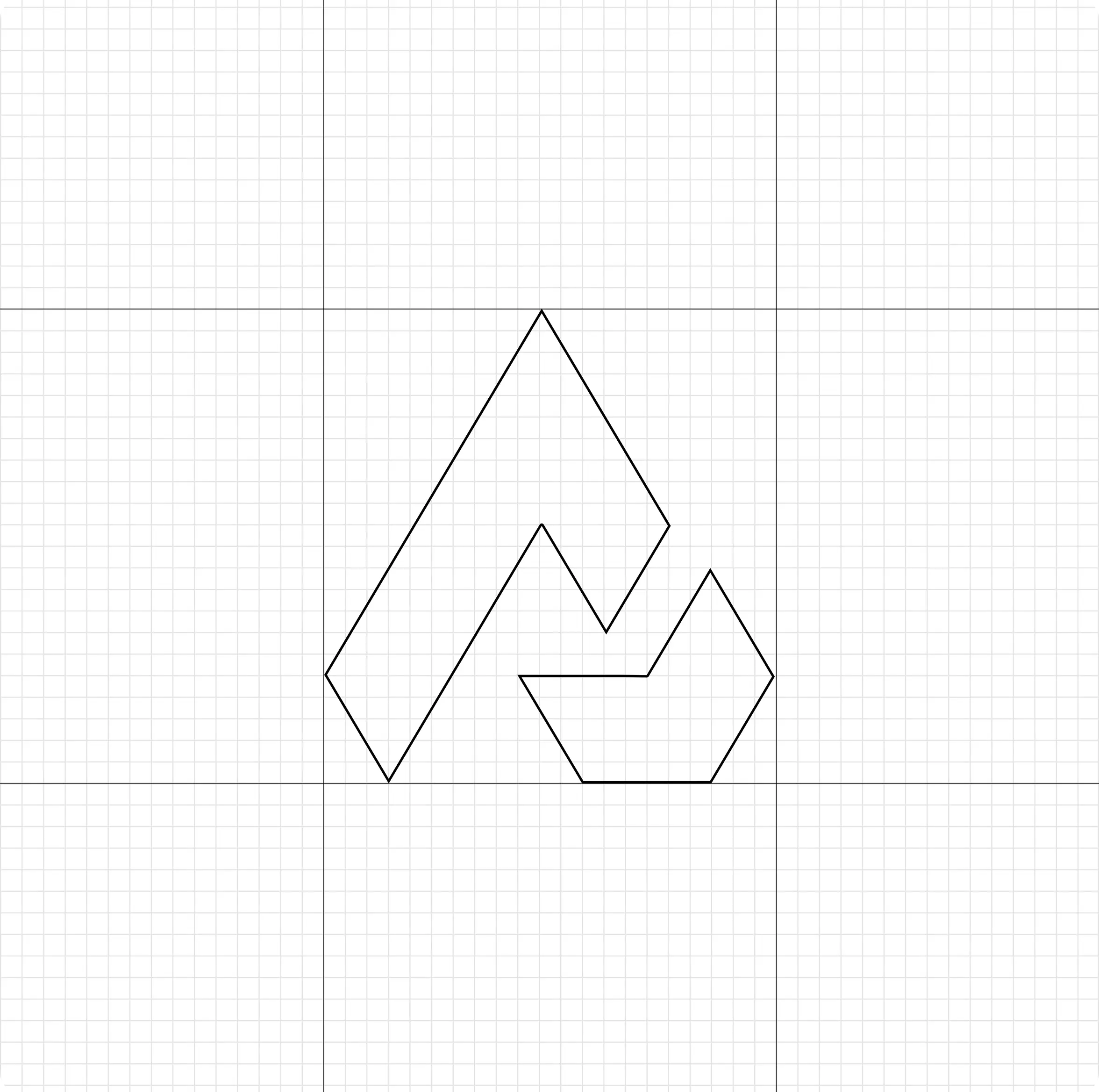
The logo is designed using a clean and structured form that represents precision, connectivity, and workflow within the testing ecosystem. The symbol reflects the relationship between testers, digital products, and performance analysis, creating a unified identity that communicates reliability and control. Its sharp geometry and balanced composition convey innovation, progress, and technical accuracy while maintaining a modern and professional appearance. The minimal yet meaningful design ensures scalability across digital platforms, interfaces, and branding applications while creating a strong and recognizable visual identity.
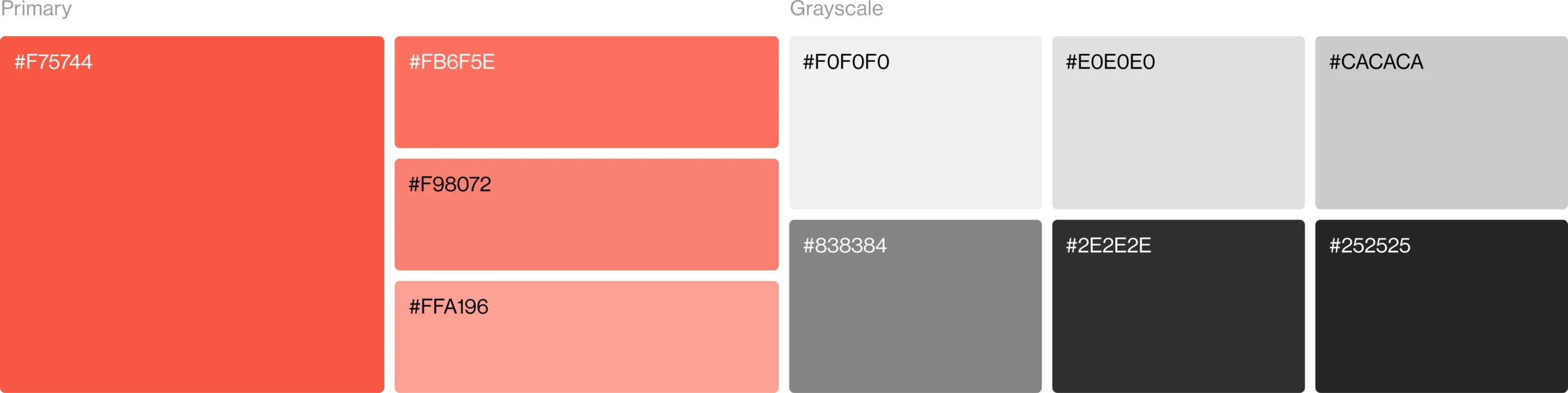
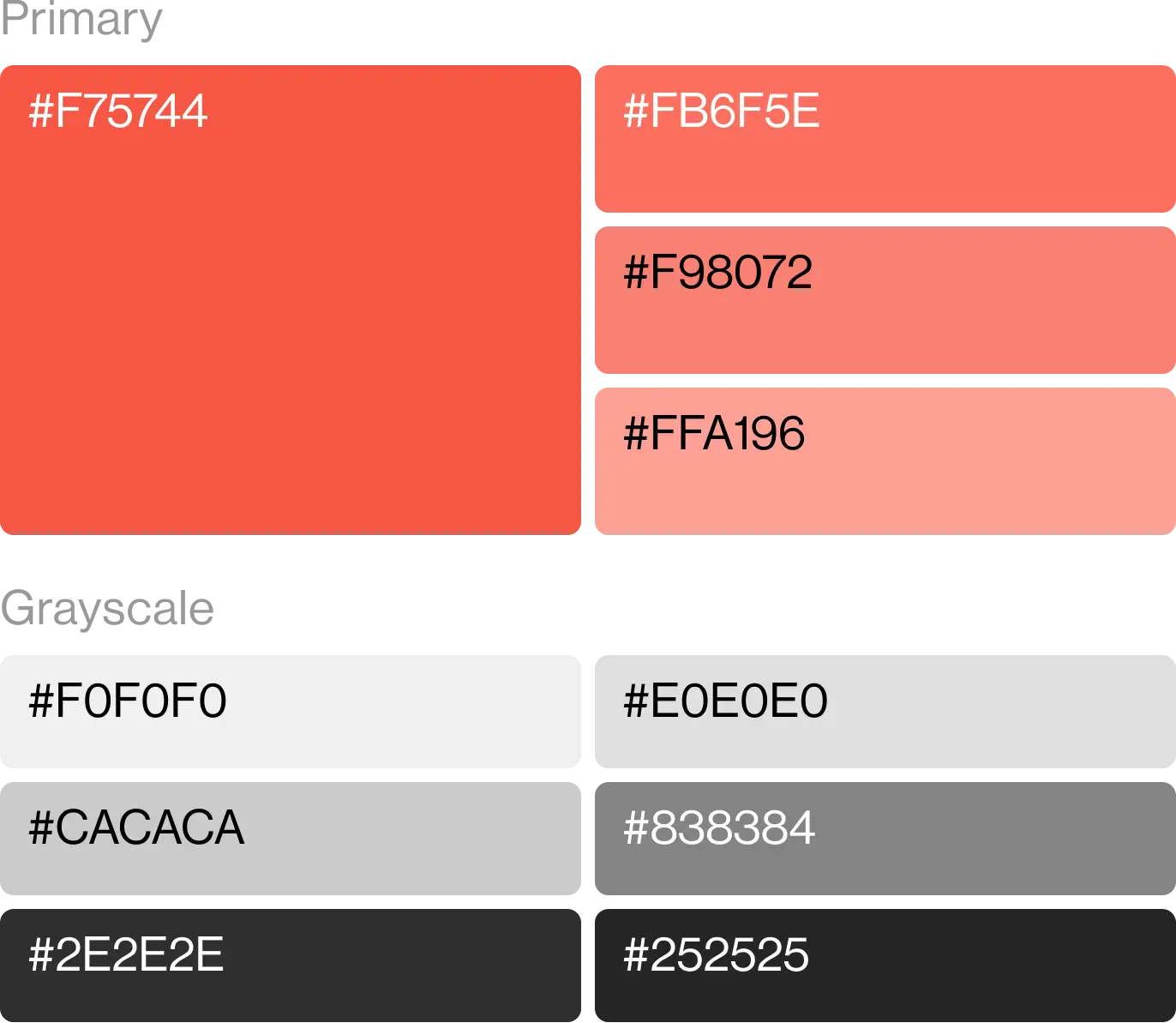
Color Palette
The color palette is built around bold and modern tones that represent innovation, technology, and digital reliability. It creates a strong visual identity while helping the platform stand out within the competitive QA and software testing industry. Supporting neutral shades maintain clarity, readability, and consistency across all digital and branding applications.
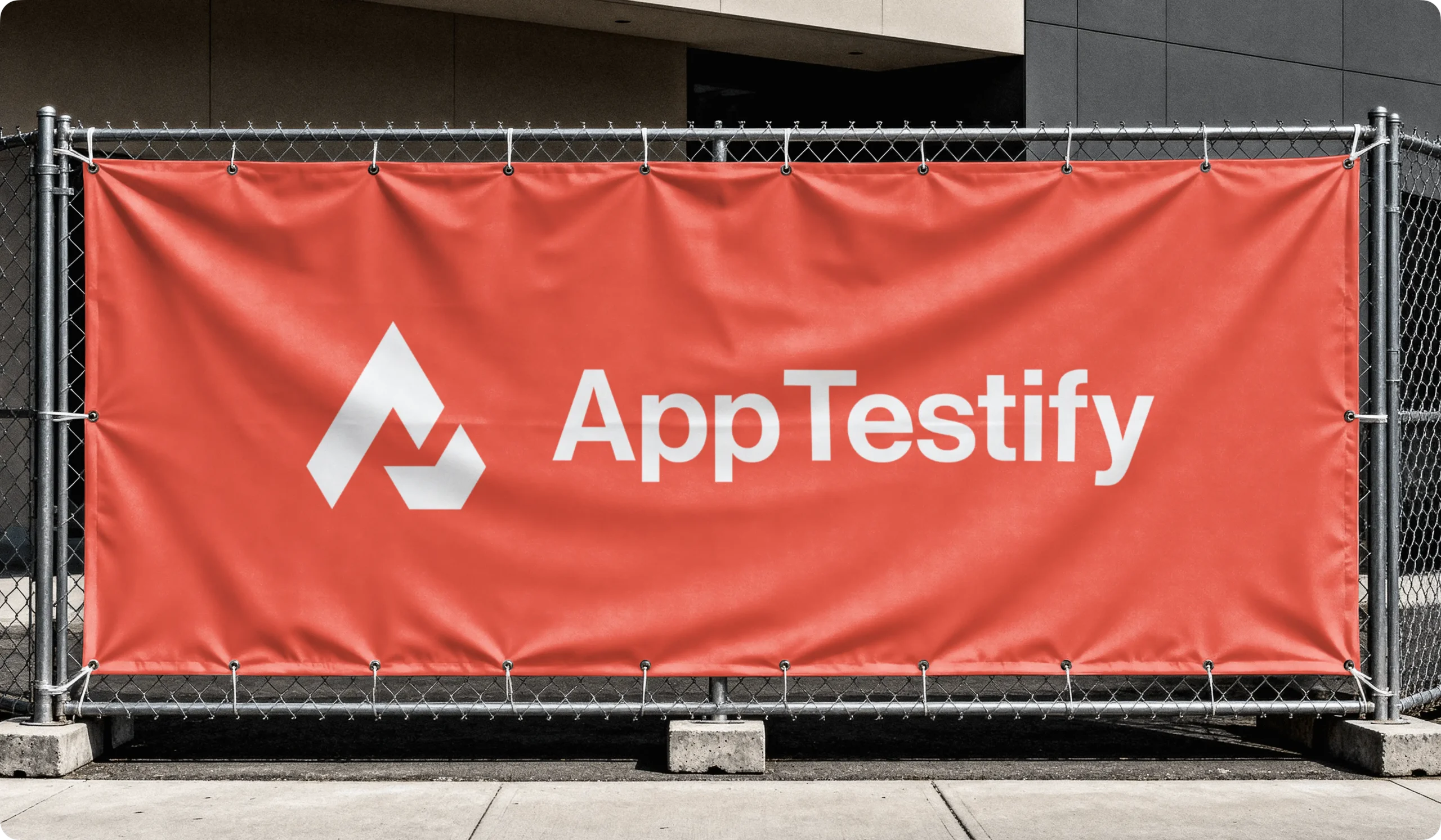
Visual Identity System
The visual identity is designed to create a modern, professional, and technology-focused brand presence. A bold and refined color palette represents innovation, performance, and digital trust, helping the platform stand out in the QA and software testing industry. Supporting neutral tones provide balance and usability while maintaining clarity across different interfaces and applications. The typography is clean, highly legible, and structured, reinforcing reliability and precision. Together, these elements create a cohesive visual system that is scalable, adaptable, and consistent across all brand touchpoints.