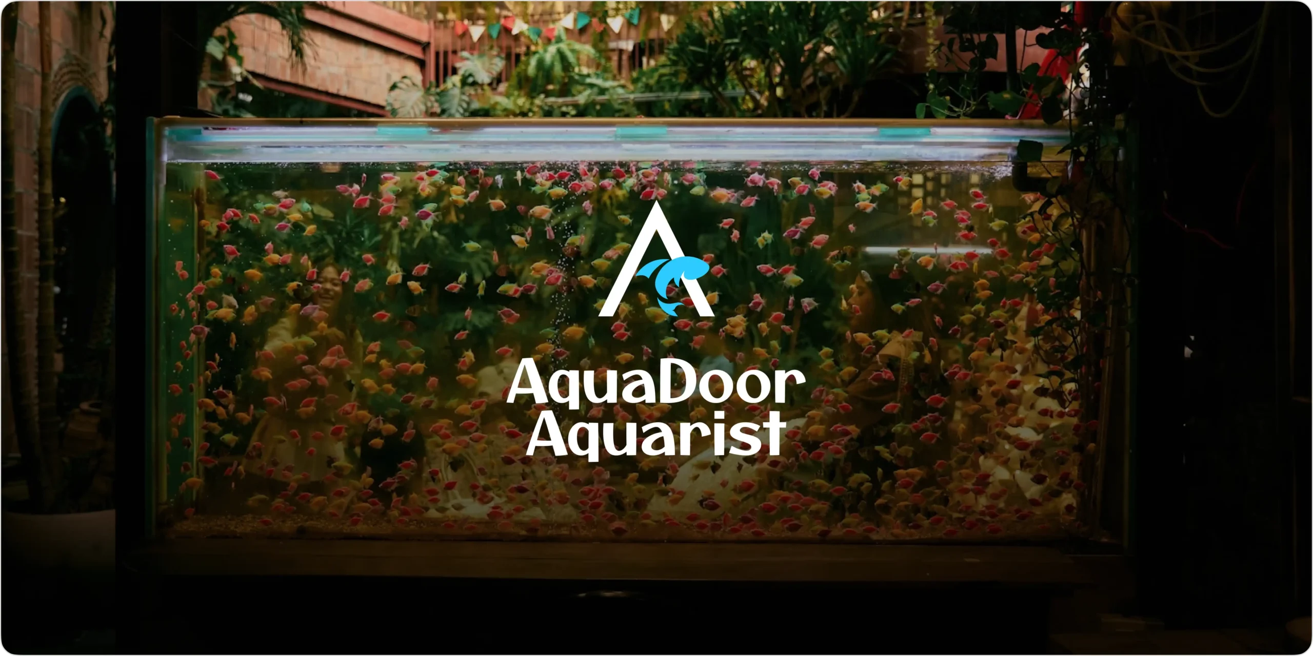
Aquadoor Aquarist is a modern digital platform designed for aquatic exploration and visitor experiences, where discovery, engagement, and accessibility are essential. The goal of the project was to create a seamless system that allows users to explore fish species, learn about marine life, and book aquarium visit tickets through a structured digital experience. From providing detailed aquatic information to simplifying online ticket booking, the platform transforms traditional visitor interactions into a smooth and engaging journey. The branding reflects this vision through a clean and immersive visual identity that communicates curiosity, nature, and modern exploration across all touchpoints.
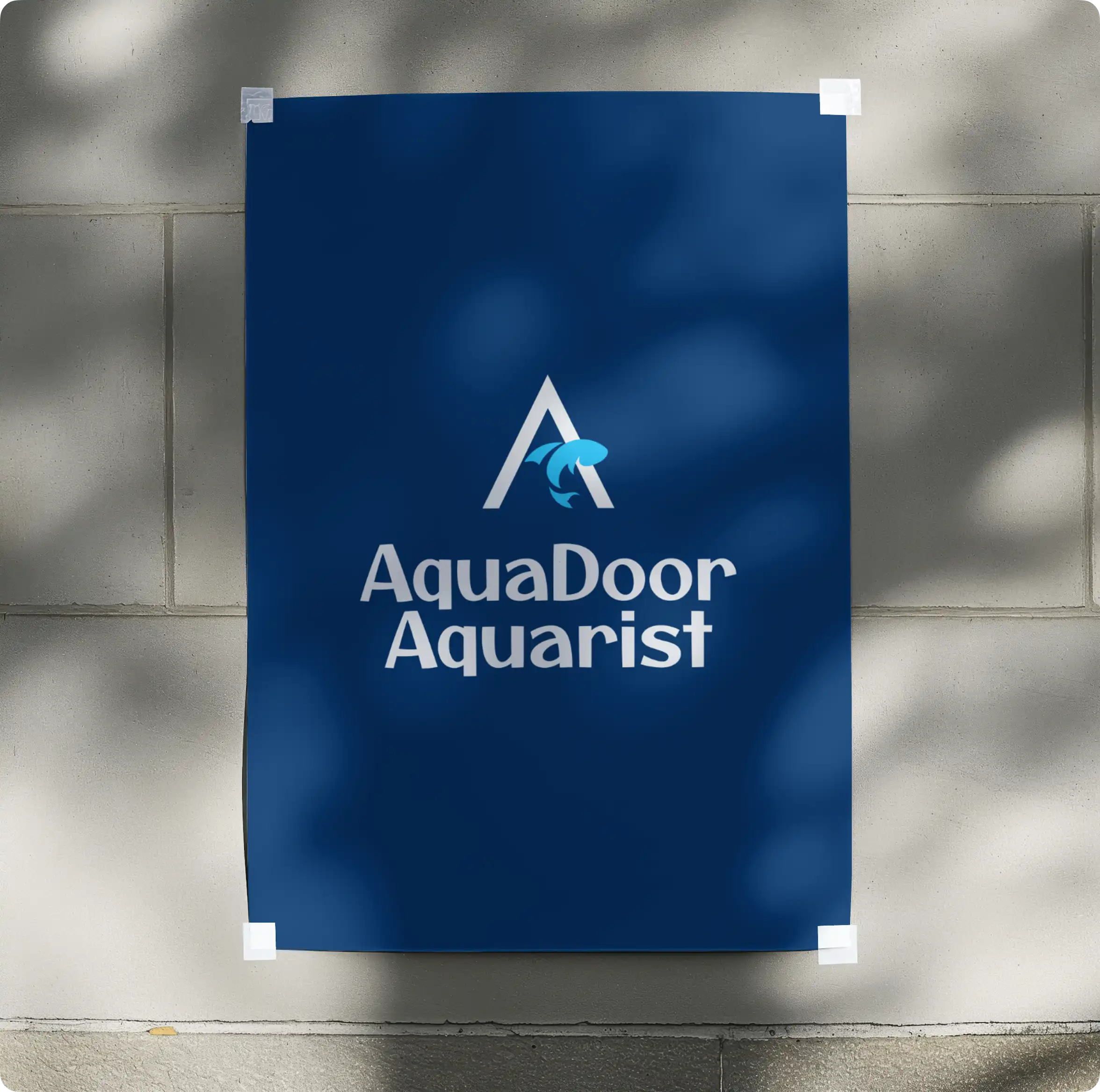
Logo Design & Concept
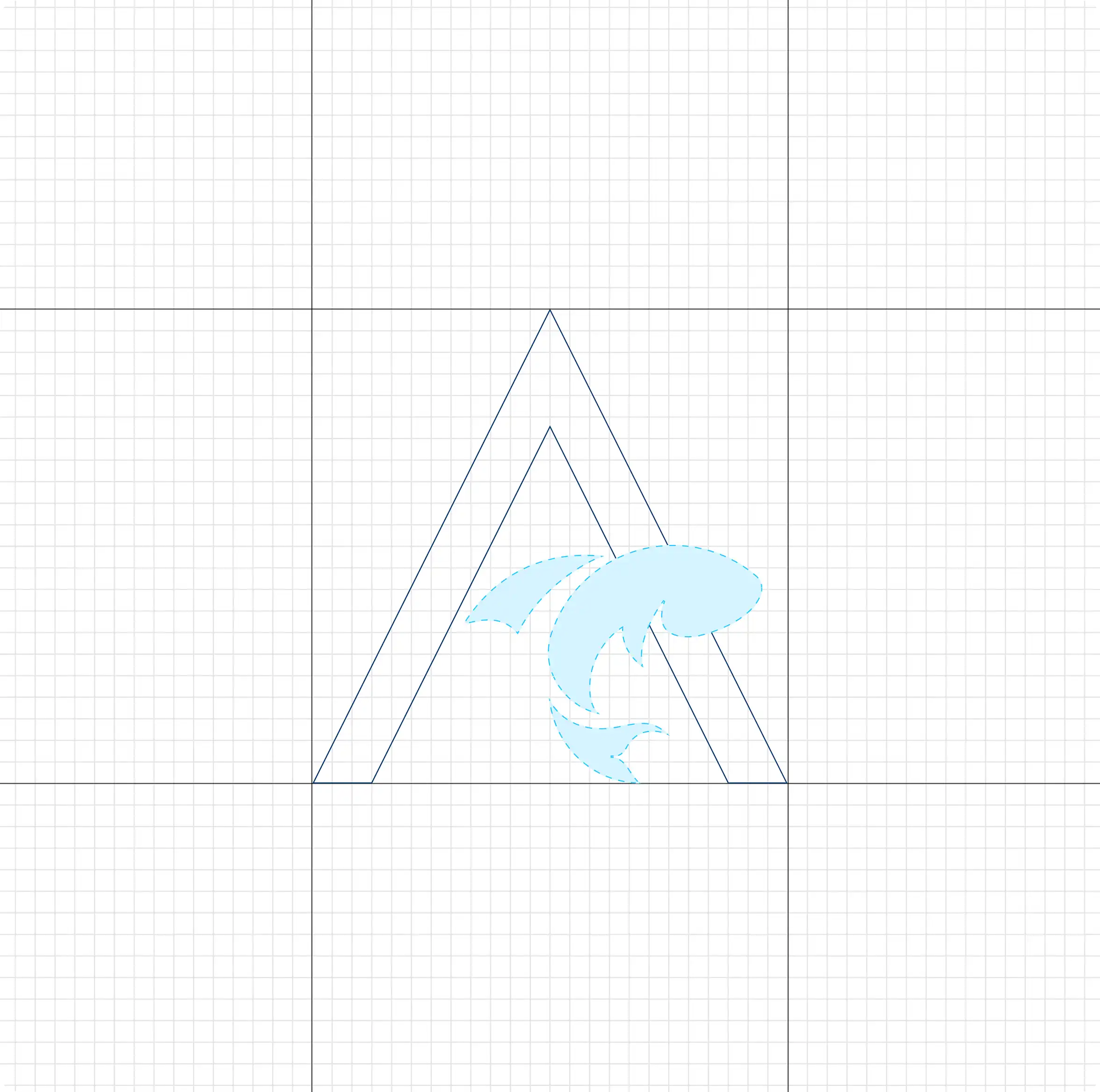
The logo is designed using a fluid and balanced form that represents marine life, exploration, and movement within the underwater ecosystem. The symbol reflects the connection between aquatic discovery, visitor experiences, and digital accessibility, creating a visual identity that communicates curiosity and trust. Its smooth curves and flowing structure convey calmness, depth, and continuous exploration while maintaining a clean and modern appearance. The design is intentionally minimal yet expressive, allowing it to adapt seamlessly across digital platforms, ticketing systems, and branding applications while maintaining a strong and recognizable identity.
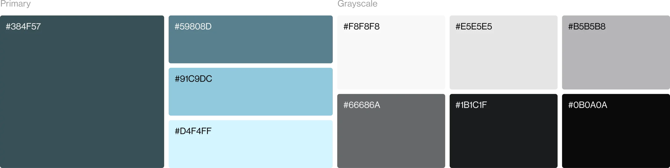
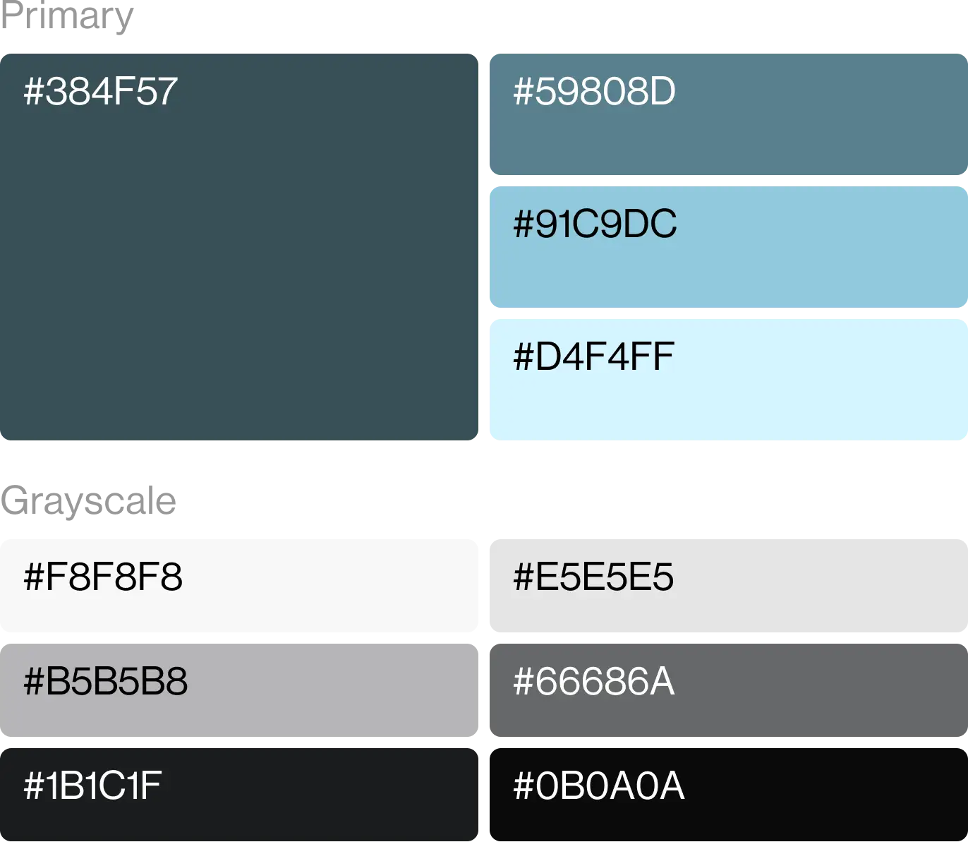
Color Palette
The color palette is built around refreshing and ocean-inspired tones that represent marine life, exploration, and calm digital experiences. It creates a visually immersive identity while helping the brand stand out within the aquatic and visitor experience industry. Supporting neutral shades maintain balance, readability, and consistency across digital platforms, ticketing systems, and branding applications.
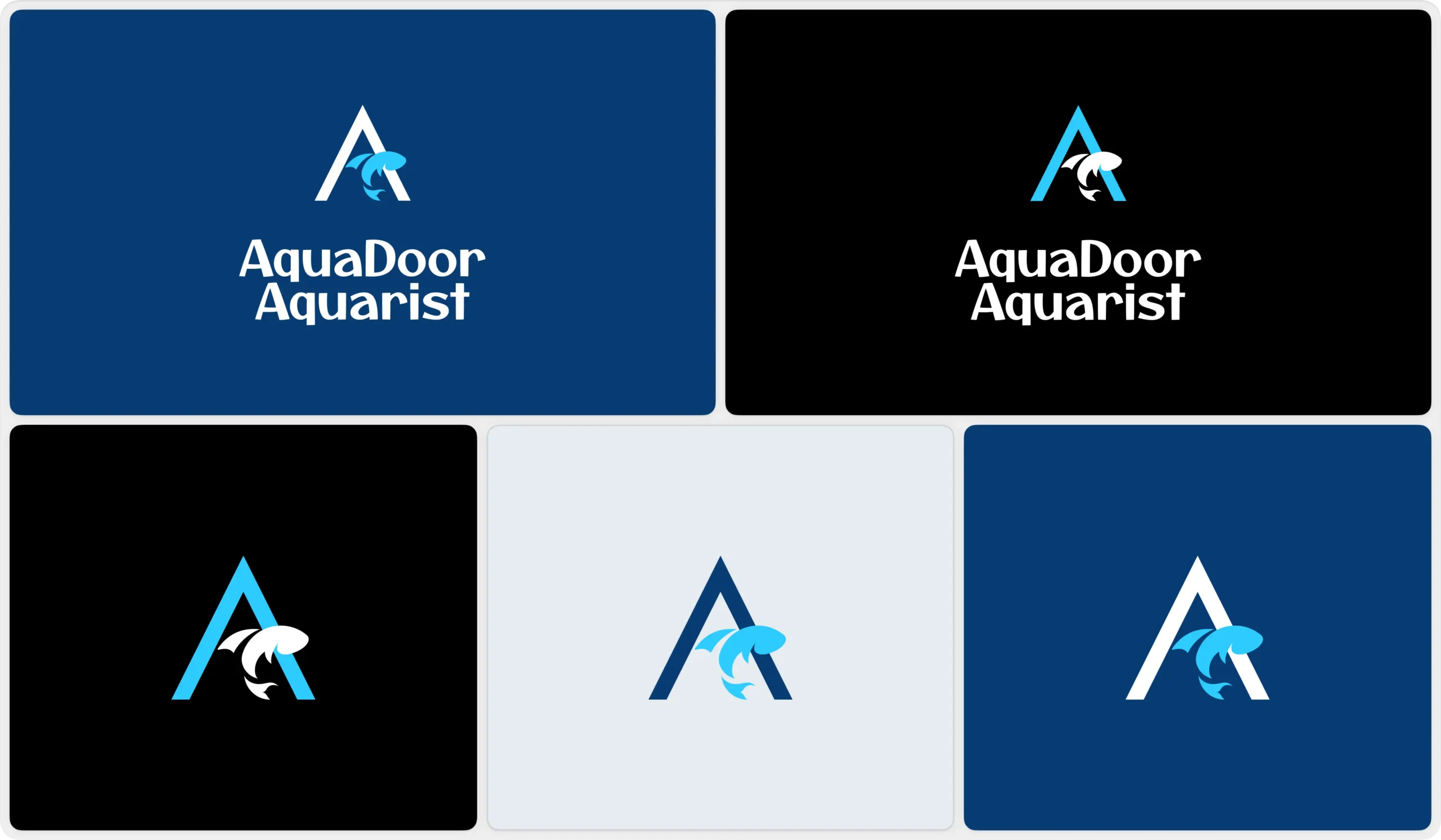
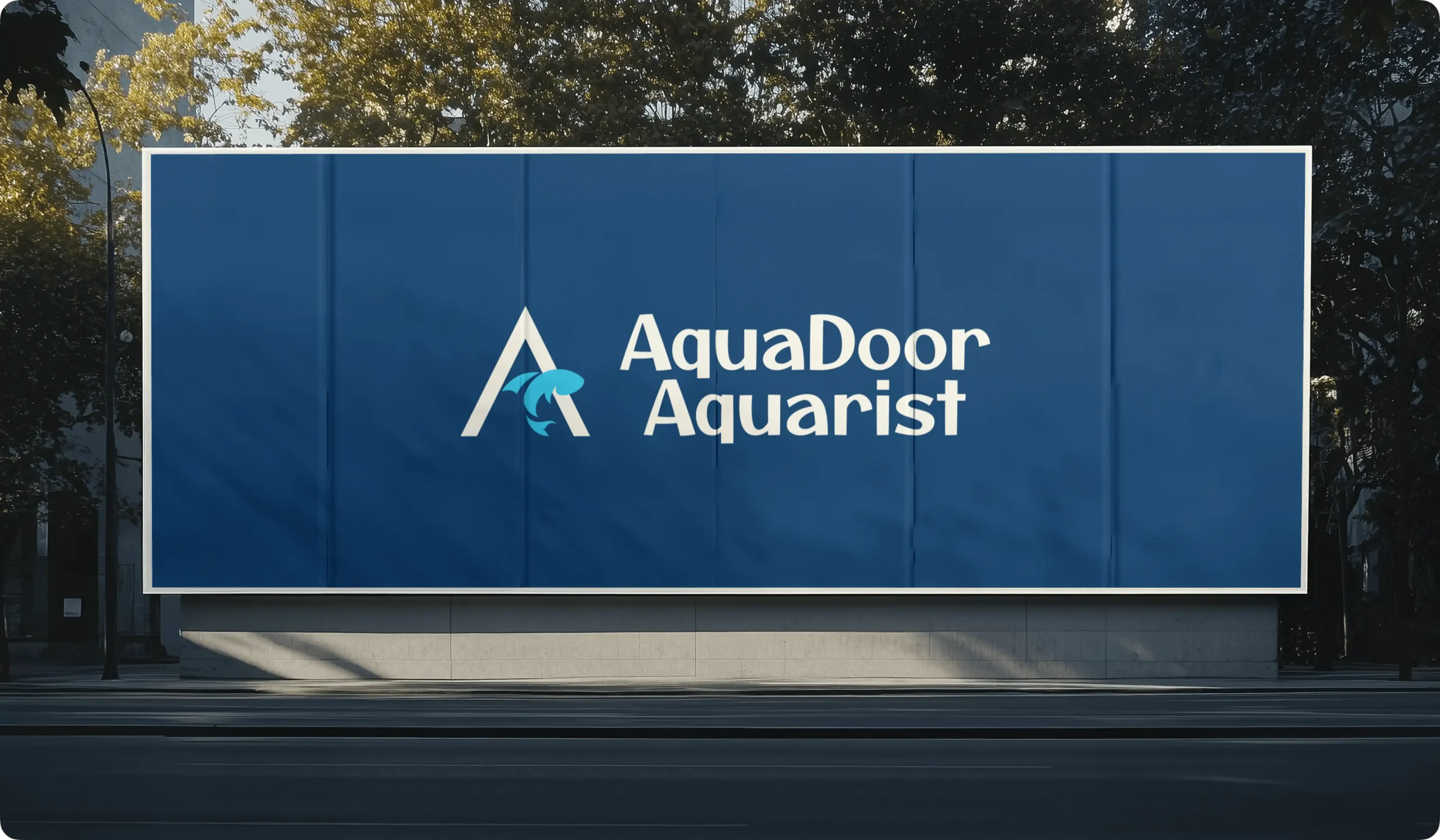
Visual Identity System
The visual identity is designed to create a modern, immersive, and nature-inspired brand presence. An ocean-inspired color palette represents marine life, exploration, and calm digital experiences, helping the brand stand out within the aquatic and entertainment industry. Supporting neutral tones provide balance and clarity while maintaining consistency across digital platforms and ticketing interfaces. The typography is clean, modern, and highly readable, reinforcing accessibility and trust. Together, these elements create a cohesive visual system that is adaptable, scalable, and consistent across all brand touchpoints.