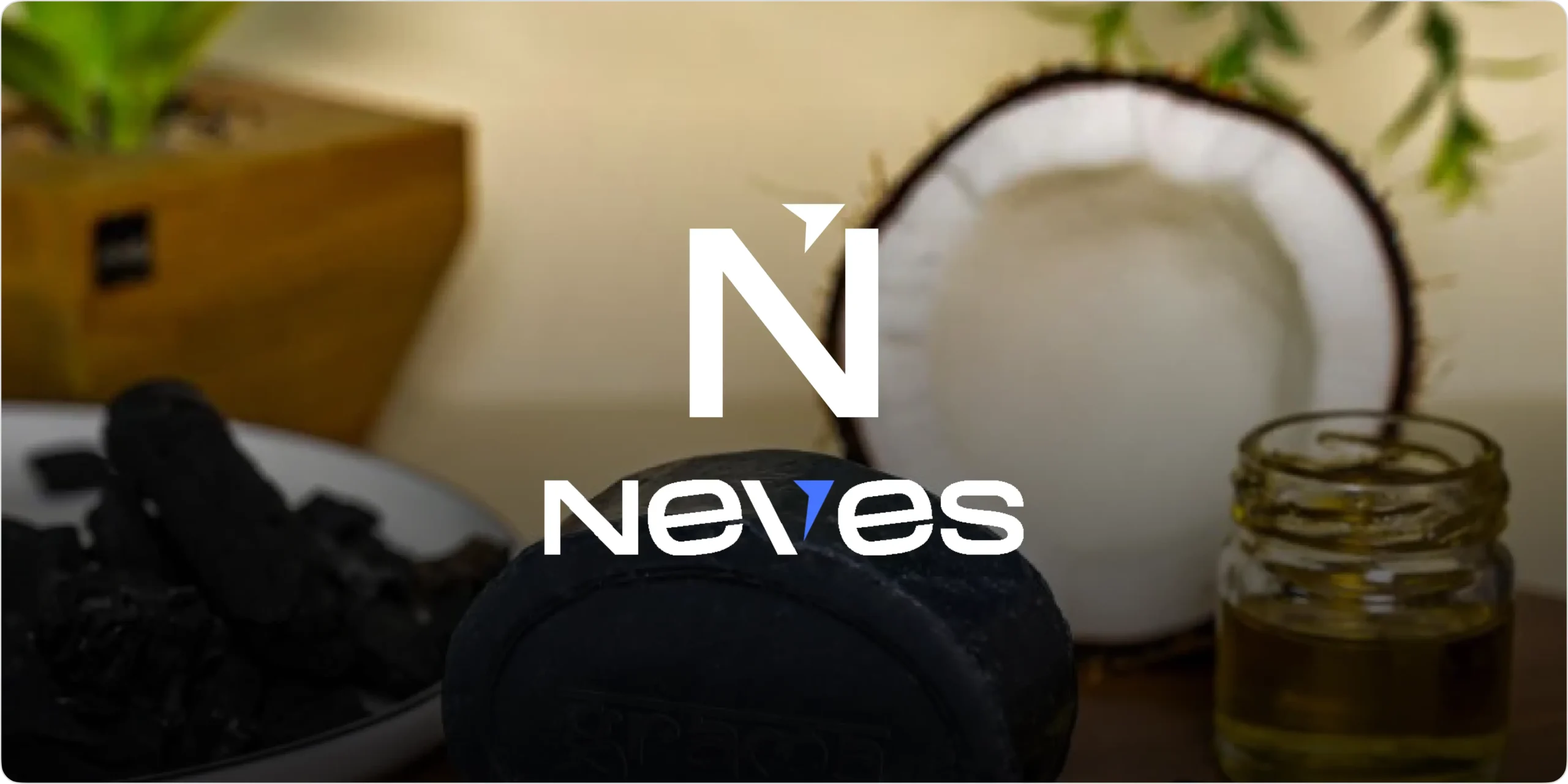
Neves is a natural skincare brand designed for people who value purity, simplicity, and healthy self-care experiences. The goal of the project was to create a clean and trustworthy ecommerce identity that highlights the authenticity of handmade and 100% natural soap products. From showcasing organic ingredients to presenting products in a warm and approachable way, the brand delivers a smooth and structured shopping experience. The branding reflects this vision through a soft and modern visual identity that communicates freshness, care, and natural wellness across all touchpoints.
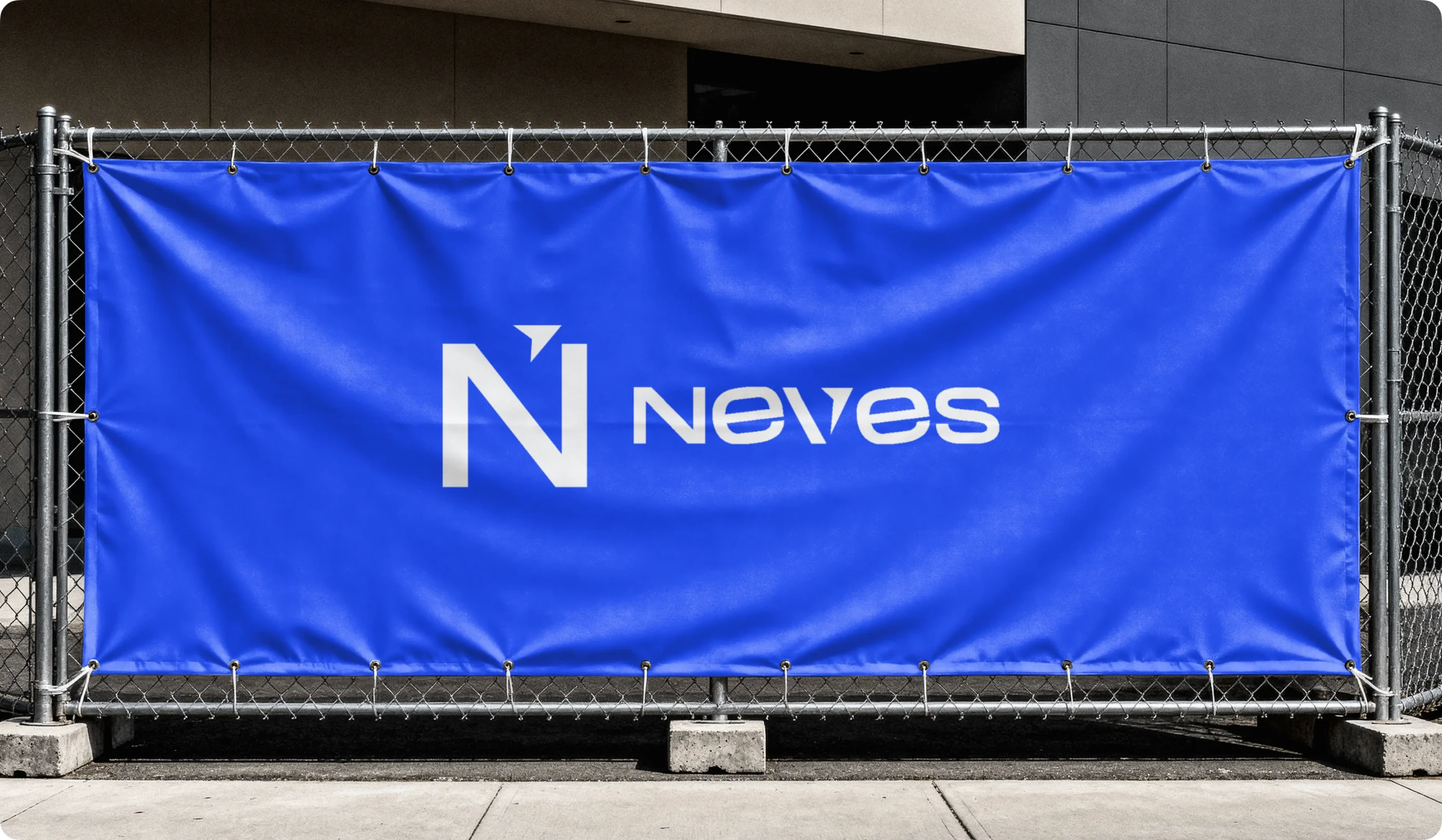
Logo Design & Concept
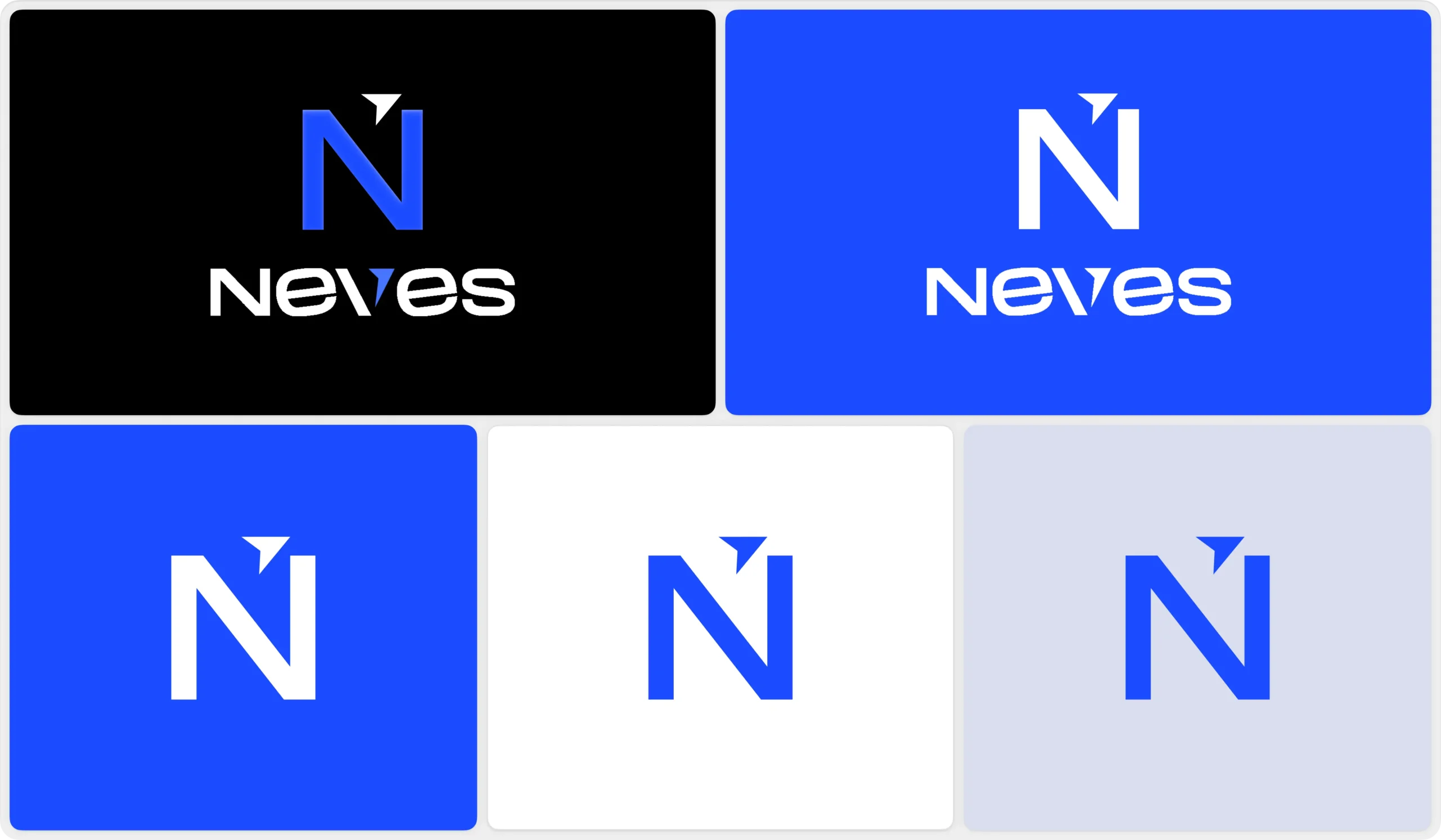
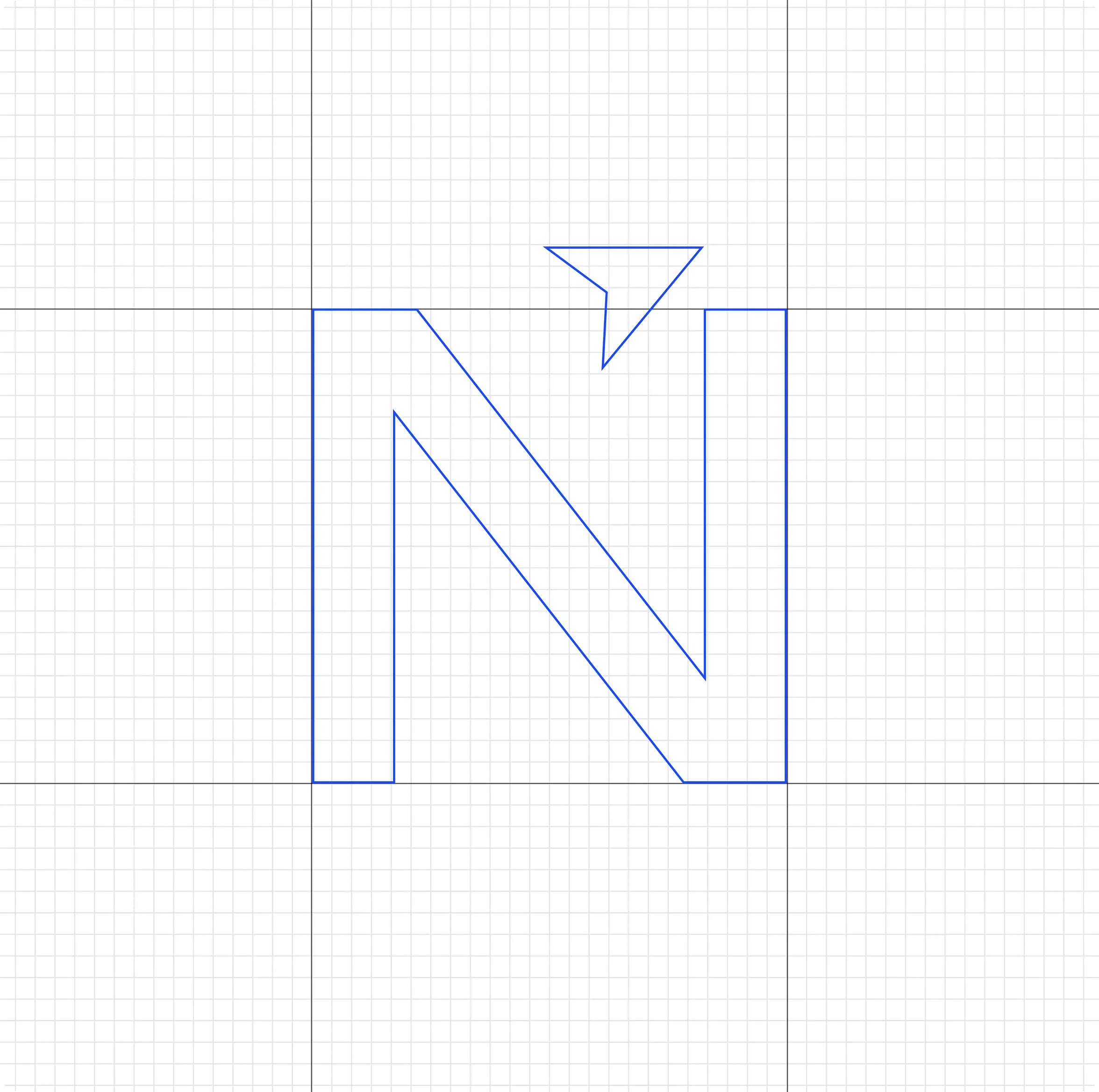
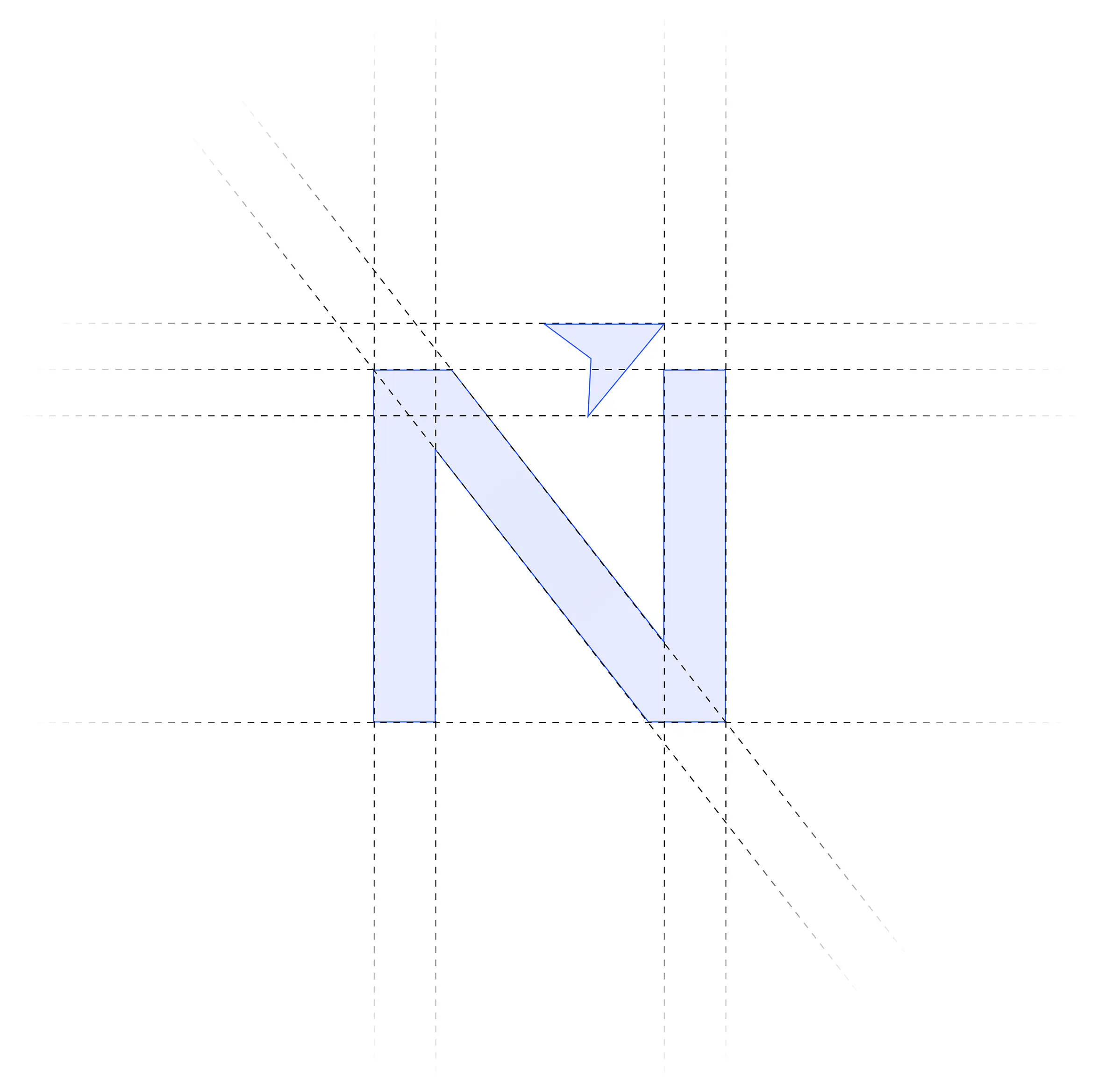
The logo is designed using a clean and balanced form that represents purity, softness, and natural wellness. The symbol reflects the connection between handmade craftsmanship, organic ingredients, and everyday skincare, creating a visual identity that communicates trust and authenticity. Its smooth curves and minimal structure convey freshness, care, and simplicity while maintaining an elegant and modern appearance. The design is intentionally minimal yet meaningful, allowing it to adapt seamlessly across packaging, digital platforms, and branding applications while maintaining a strong and recognizable identity.
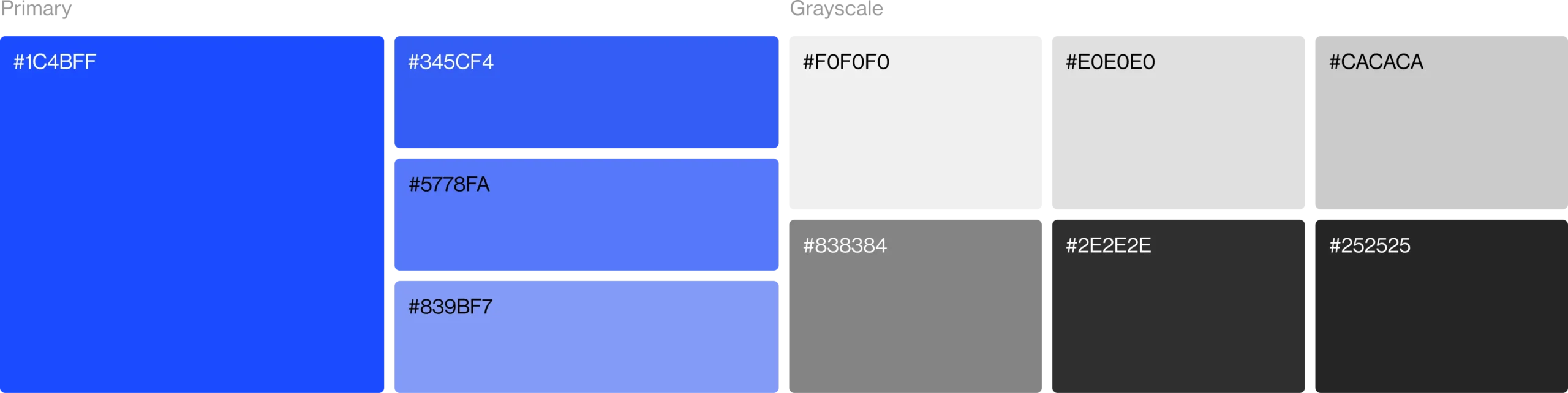
Color Palette
The color palette is built around soft and natural tones that represent purity, freshness, and organic skincare. It creates a calm and welcoming visual identity while helping the brand stand out within the natural wellness and handmade product industry. Supporting neutral shades maintain balance, readability, and consistency across packaging, digital platforms, and branding applications.
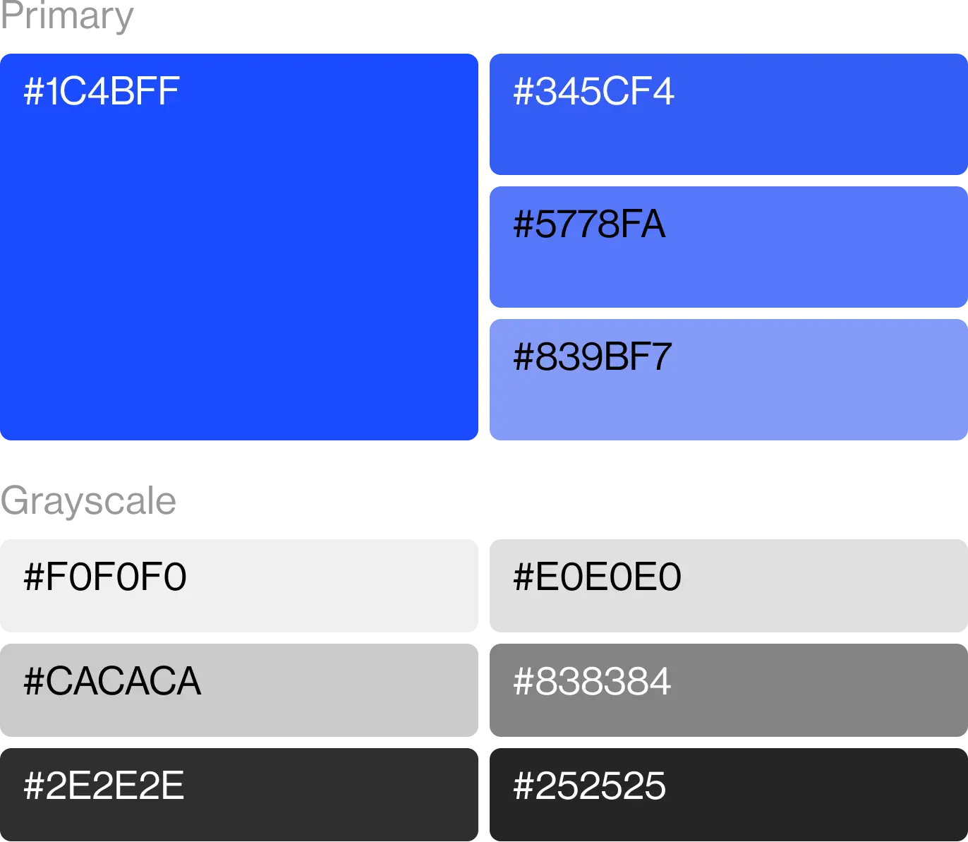
Visual Identity System
The visual identity is designed to create a soft, modern, and natural brand presence. A refined and earthy color palette represents purity, freshness, and handmade skincare, helping the brand stand out in the natural wellness industry. Supporting neutral tones provide balance and clarity while maintaining consistency across packaging and digital platforms. The typography is clean, elegant, and highly readable, reinforcing a sense of trust and simplicity. Together, these elements create a cohesive visual system that is adaptable, scalable, and consistent across all brand touchpoints.